

Unit 2: Exploring Two-Variable Data
Two Categorical Variables
Qualitative data often encompass two categorical variables that may or may not have a dependent relationship. These data can be displayed in a two-way table (also called a contingency table).
➥ Example 2.1
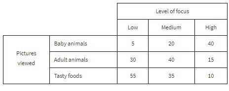
The Cuteness Factor: A Japanese study had 250 volunteers look at pictures of cute baby animals, adult animals, or tasty-looking foods, before testing their level of focus in solving puzzles.
The grand total of all cell values, 250 in this example, is called the table total.
Pictures viewed is the row variable, whereas level of focus is the column variable.
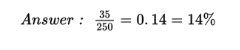
What percent of the people in the survey viewed tasty foods and had a medium level of focus?
The standard method of analyzing the table data involves first calculating the totals for each row and each column.
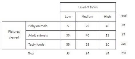
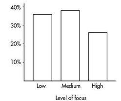
These totals are placed in the right and bottom margins of the table and thus are called marginal frequencies (or marginal totals). These marginal frequencies can then be put in the form of proportions or percentages. The marginal distribution of the level of focus is:
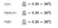
This distribution can be displayed in a bar graph as follows:
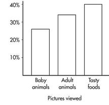
Similarly, we can determine the marginal distribution for the pictures viewed:
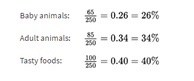
The representative bar graph is:
Two Quantitative Variables
Many important applications of statistics involve examining whether two or more quantitative (numerical) variables are related to one another.
These are also called bivariate quantitative data sets.
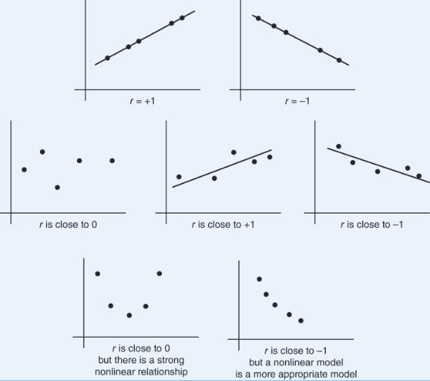
Scatterplot - gives an immediate visual impression of a possible relationship between two variables, while a numerical measurement, called the correlation coefficient - often used as a quantitative value of the strength of a linear relationship. In either case, evidence of a relationship is not evidence of causation.
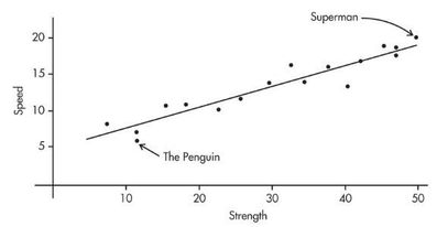
➥ Example 2.2
Comic books heroes and villains can be compared with regard to various attributes. The scatterplot below looks at speed (measured on a 20-point scale) versus strength (measured on a 50-point scale) for 17 such characters. Does there appear to be a linear association?
Positively associated- When larger values of one variable are associated with larger values of a second variable.
Negatively associated - When larger values of one are associated with smaller values of the other, the variables are called negatively associated.
The strength of the association is gauged by how close the plotted points are to a straight line.
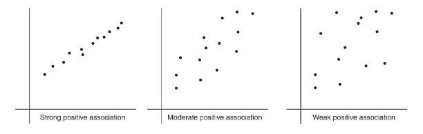
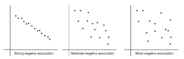
To describe a scatterplot you must consider form (linear or nonlinear), direction (positive or negative), strength (weak, moderate, or strong), and unusual features (such as outliers and clusters). As usual, all answers must also mention context.
Correlation
Correlation measures the strength of only a linear relationship.
Correlation, designated by r, has the formula in terms of the means and standard deviations of the two variables.
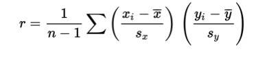
The correlation formula gives the following:
The formula is based on standardized scores (z**-scores**), and so changing units does not change the correlation r.
Since the formula does not distinguish between which variable is called x and which is called y, interchanging the variables (on the scatterplot) does not change the value of the correlation r.
The division in the formula gives that the correlation r is unit-free.
The value of r always falls between −1 and +1, with −1 indicating perfect negative correlation and +1 indicating perfect positive correlation. It should be stressed that a correlation at or near zero does not mean there is not a relationship between the variables; there may still be a strong nonlinear relationship. Additionally, a correlation close to −1 or +1 does not necessarily mean that a linear model is the most appropriate model.
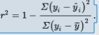
r2 (called the coefficient of determination) - is the ratio of the variance of the predicted values ŷ to the variance of the observed values y.
That is, there is a partition of the y-variance, and r2 is the proportion of this variance that is predictable from a knowledge of x.
We can say that r2 gives the percentage of variation in the response variable, y, that is explained by the variation in the explanatory variable, x. Or we can say that r2 gives the percentage of variation in y that is explained by the linear regression model between x and y. In any case, always interpret r2 in context of the problem. Remember when calculating r from r2 that r may be positive or negative, and that r will always take the same sign as the slope.
Alternatively, r2 is 1 minus the proportion of unexplained variance:
➥ Example 2.3
The correlation between Total Points Scored and Total Yards Gained for the 2021 season among a set of college football teams is r = 0.84. What information is given by the coefficient of determination?
Solution: r2 = (0.84)2 = 0.7056. Thus, 70.56% of the variation in Total Points Scored can be accounted for by (or predicted by or explained by) the linear relationship between Total Points Scored and Total Yards Gained. The other 29.44% of the variation in Total Points Scored remains unexplained.
Least Squares Regression
What is the best-fitting straight line that can be drawn through a set of points?
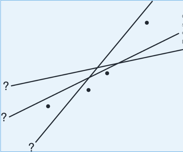
By best-fitting straight line we mean the straight line that minimizes the sum of the squares of the vertical differences between the observed values and the values predicted by the line.
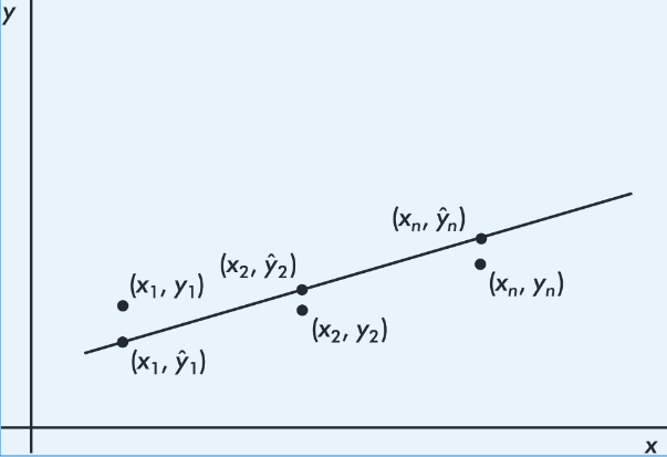
That is, in the above figure, we wish to minimize

It is reasonable, intuitive, and correct that the best-fitting line will pass through ( x̄,ȳ), where x̄ and ȳare the means of the variables X and Y. Then, from the basic expression for a line with a given slope through a given point, we have:
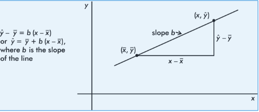
The slope b can be determined from the formula

where r is the correlation and sx and sy are the standard deviations of the two sets. That is, each standard deviation change in x results in a change of r standard deviations in ŷ. If you graph z-scores for the y-variable against z-scores for the x-variable, the slope of the regression line is precisely r, and in fact, the linear equation becomes, 
Example 2.4
A sociologist conducts a survey of 15 teens. The number of "close friends" and the number of times Facebook is checked every evening are noted for each student. Letting X and Y represent the number of close friends and the number of Facebook checks, respectively, gives:
X: | 25 | 23 | 30 | 25 | 20 | 33 | 18 | 21 | 22 | 30 | 26 | 26 | 27 | 29 | 20 |
|---|---|---|---|---|---|---|---|---|---|---|---|---|---|---|---|
Y: | 10 | 11 | 14 | 12 | 8 | 18 | 9 | 10 | 10 | 15 | 11 | 15 | 12 | 14 | 11 |
Identify the variables.
Draw a scatterplot.
Describe the scatterplot.
What is the equation of the regression line? Interpret the slope in context.
Interpret the coefficient of determination in context.
Predict the number of evening Facebook checks for a student with 24 close friends.
Solution:
The explanatory variable, X, is the number of close friends and the response variable, Y, is the number of evening Facebook checks.
Plotting the 15 points (25, 10), (23, 11), . . . , (20, 11) gives an intuitive visual impression of the relationship:
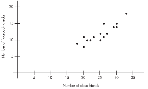
The relationship between the number of close friends and the number of evening Facebook checks appears to be linear, positive, and strong.
Calculator software gives ŷ= -1.73 + 0.5492x , where x is the number of close friends and y is the number of evening Facebook checks. We can instead write the following:

The slope is 0.5492. Each additional close friend leads to an average of 0.5492 more evening Facebook checks.
Calculator software gives r = 0.8836, so r2 = 0.78. Thus, 78% of the variation in the number of evening Facebook checks is accounted for by the variation in the number of close friends.
–1.73 + 0.5492(24) = 11.45 evening Facebook checks. Students with 24 close friends will average 11.45 evening Facebook checks.
Residuals
Residual - difference between an observed and a predicted value.
When the regression line is graphed on the scatterplot, the residual of a point is the vertical distance the point is from the regression line.
A positive residual means the linear model underestimated the actual response value.
Negative residual means the linear model overestimated the actual response value.
➥ Example 2.4
We calculate the predicted values from the regression line in Example 2.13 and subtract from the observed values to obtain the residuals:
x | 30 | 90 | 90 | 75 | 60 | 50 |
|---|---|---|---|---|---|---|
y | 185 | 630 | 585 | 500 | 430 | 400 |
ŷ | 220.3 | 613.3 | 613.3 | 515.0 | 416.8 | 351.3 |
y-ŷ | –35.3 | 16.7 | –28.3 | –15.0 | 13.2 | 48.7 |
Note that the sum of the residuals is
–35.3 + 16.7 – 28.3 – 15.0 + 13.2 + 48.7 = 0
The above equation is true in general; that is, the sum and thus the mean of the residuals is always zero.
Outliers, Influential Points, and Leverage
In a scatterplot, regression outliers are indicated by points falling far away from the overall pattern. That is, outliers are points with relatively large discrepancies between the value of the response variable and a predicted value for the response variable.
In terms of residuals, a point is an outlier if its residual is an outlier in the set of residuals.
➥ Example 2.5
A scatterplot of grade point average (GPA) versus weekly television time for a group of high school seniors is as follows:
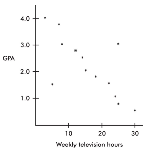
By direct observation of the scatterplot, we note that there are two outliers: one person who watches 5 hours of television weekly yet has only a 1.5 GPA, and another person who watches 25 hours weekly yet has a 3.0 GPA. Note also that while the value of 30 weekly hours of television may be considered an outlier for the television hours variable and the 0.5 GPA may be considered an outlier for the GPA variable, the point (30, 0.5) is not an outlier in the regression context because it does not fall off the straight-line pattern.
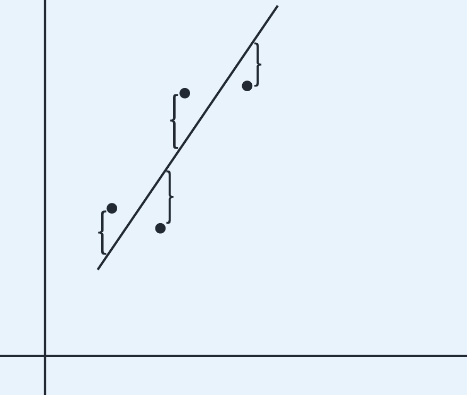
Influential Scores - Scores whose removal would sharply change the regression line. Sometimes this description is restricted to points with extreme x-values. An influential score may have a small residual but still have a greater effect on the regression line than scores with possibly larger residuals but average x-values.
➥ Example 2.
Consider the following scatterplot of six points and the regression line:
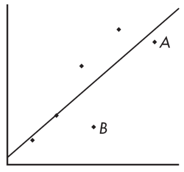
The heavy line in the scatterplot on the left below shows what happens when point A is removed, and the heavy line in the scatterplot on the right below shows what happens when point B is removed.
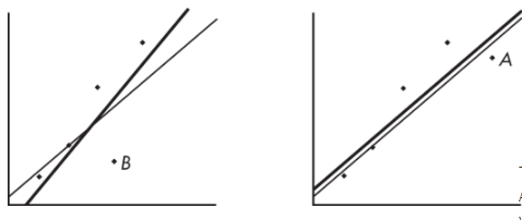
Note that the regression line is greatly affected by the removal of point A but not by the removal of point B. Thus, point A is an influential score, while point B is not. This is true in spite of the fact that point A is closer to the original regression line than point B.
A point is said to have high leverage if its x-value is far from the mean of the x-values. Such a point has the strong potential to change the regression line. If it happens to line up with the pattern of the other points, its inclusion might not influence the equation of the regression line, but it could well strengthen the correlation and r2, the coefficient of determination.
➥ Example 2.7
Consider the four scatterplots below, each with a cluster of points and one additional point separated from the cluster.
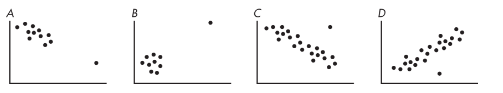
In A, the additional point has high leverage (its x-value is much greater than the mean x-value), has a small residual (it fits the overall pattern), and does not appear to be influential (its removal would have little effect on the regression equation).
In B, the additional point has high leverage (its x-value is much greater than the mean x-value), probably has a small residual (the regression line would pass close to it), and is very influential (removing it would dramatically change the slope of the regression line to close to 0).
In C, the additional point has some leverage (its x-value is greater than the mean x-value but not very much greater), has a large residual compared to other residuals (so it's a regression outlier), and is somewhat influential (its removal would change the slope to more negative).
In D, the additional point has no leverage (its x-value appears to be close to the mean x-value), has a large residual compared to other residuals (so it's a regression outlier), and is not influential (its removal would increase the y-intercept very slightly and would have very little if any effect on the slope).
More on Regression
The regression equation 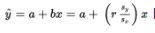 has important implications.
If the correlation r = +1, then
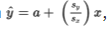
, and for each standard deviation sx increase in x, the predicted y-value increases by Sy.
If, for example, r = +0.4, then
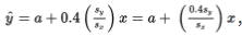
, and for each standard deviation sx increase in x, the predicted y-value increases by 0.4 Sy.
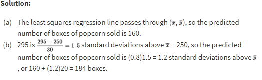
➥ Example 2.8
Suppose x = attendance at a movie theater, y = number of boxes of popcorn sold, and we are given that there is a roughly linear relationship between x and y. Suppose further we are given the summary statistics:

When attendance is 250, what is the predicted number of boxes of popcorn sold?
When attendance is 295, what is the predicted number of boxes of popcorn sold?
The regression equation for predicting x from y has the slope:

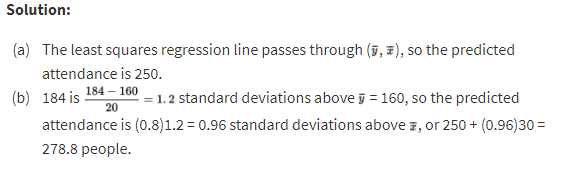
➥ Example 2.9
Use the same attendance and popcorn summary statistics from Example 2.24 above.
When 160 boxes of popcorn are sold, what is the predicted attendance?
When 184 boxes of popcorn are sold, what is the predicted attendance?
Transformations to Achieve Linearity
The nonlinear model can sometimes be revealed by transforming one or both of the variables and then noting a linear relationship. Useful transformations often result from using the log or ln buttons on your calculator to create new variables.
➥ Example 2.10
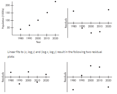
Consider the following years and corresponding populations:
Year, x: | 1980 | 1990 | 2000 | 2010 | 2020 |
|---|---|---|---|---|---|
Population (1000s), y: | 44 | 65 | 101 | 150 | 230 |

So, 94.3% of the variability in population is accounted for by the linear model. However, the scatterplot and residual plot indicate that a nonlinear relationship would be an even stronger model.