


Unit 1: Exploring One-Variable Data
Categorical Variables
A categorical (or qualitative) variable takes on values that are category names or group labels.
The values can be organized into frequency tables or relative frequency tables or can be represented graphically by displays such as bar graphs (bar charts), dot plots, and pie charts.
➥ Example 1.1
During the first week of 2022, the results of a survey revealed that 1,100 parents wanted to keep the school year to the current 180 days, 300 wanted to shorten it to 160 days, 500 wanted to extend it to 200 days, and 100 expressed no opinion. (Noting that there were 2,000 parents surveyed, percentages can be calculated.)
A table showing frequencies and relative frequencies:
Desired School Length | Number of Parents (frequency) | Relative Frequency | Percent of Parents |
|---|---|---|---|
180 days | 1100 | 1100/2000 = 0.55 | 55% |
160 days | 300 | 300/2000 = 0.15 | 15% |
200 days | 500 | 500/2000 = 0.25 | 25% |
No opinion | 100 | 100/2000 = 0.05 | 5% |
Frequency tables give the number of cases falling into each category.
Relative frequency tables give the proportion or percent of cases falling into each category.
Representing a Quantitative Variable with Tables and Graphs
A quantitative variable takes on numerical values for a measured or counted quantity.
The values can be organized into frequency tables or relative frequency tables or can be represented graphically by displays such as dotplots, histograms, stemplots, cumulative relative frequency plots, or boxplots.
A quantitative variable can be categorized as either discrete or continuous.
discrete quantitative variable - takes on a finite or countable number of values. There are “gaps” between each of the values.
continuous quantitative variable can take on uncountable or infinite values with no gaps, such as heights and weights of students.
➥ Example 1.2
Suppose there are 2,200 seniors in a city’s six high schools. Four hundred of the seniors are taking no AP classes, 500 are taking one, 900 are taking two, 300 are taking three, and 100 are taking four. These data can be displayed in the following histogram:
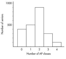
Sometimes, instead of labeling the vertical axis with frequencies, it is more convenient or more meaningful to use relative frequencies, that is, frequencies divided by the total number in the population. In this example, divide the “number of seniors” by the total number in the population.
Number of AP classes | Frequency | Relative frequency |
|---|---|---|
0 | 400 | 400/2200 = 0.18 |
1 | 500 | 500/2200 = 0.23 |
2 | 900 | 900/2200 = 0.41 |
3 | 300 | 300/2200 = 0.14 |
4 | 100 | 100/2200 = 0.05 |
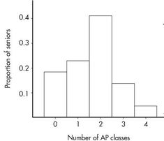
Note that the shape of the histogram is the same whether the vertical axis is labeled with frequencies or with relative frequencies. Sometimes we show both frequencies and relative frequencies on the same graph.
Describing the Distribution of a Quantitative Variable
Looking at a graphical display, we see that two important aspects of the overall pattern are:
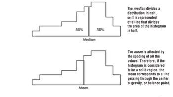
Center - which separates the values (or area under the curve in the case of a histogram) roughly in half.
Spread - that is, the scope of the values from smallest to largest.
Other important aspects of the overall pattern are:
clusters - which show natural subgroups into which the values fall. (Example - the salaries of teachers in Ithaca, NY, fall into three overlapping clusters: one for public school teachers, a higher one for Ithaca College professors, and an even higher one for Cornell University professors.)
gaps - which show holes where no values fall. (Example - the Office of the Dean sends letters to students being put on the honor roll and to those being put on academic warning for low grades; thus, the GPA distribution of students receiving letters from the Dean has a huge middle gap.)
➥ Example 1.3
Hodgkin’s lymphoma is a cancer of the lymphatic system, the system that drains excess fluid from the blood and protects against infection. Consider the following histogram:
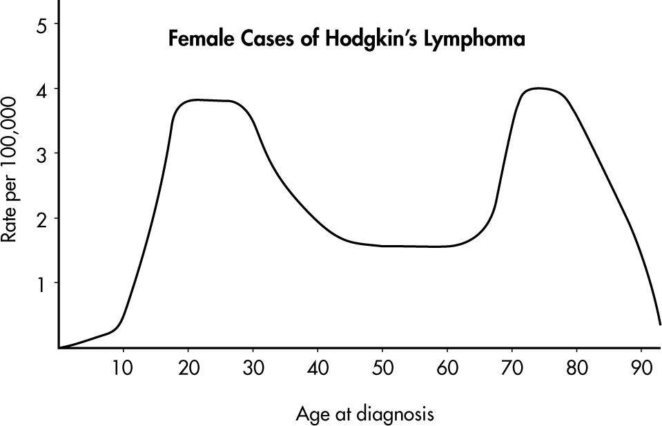
Simply saying that the average age at diagnosis for female cases is around 50 clearly misses something. The distribution of ages at diagnosis for female cases of Hodgkin’s lymphoma is bimodal with two distinct clusters, centered at 25 and 75.
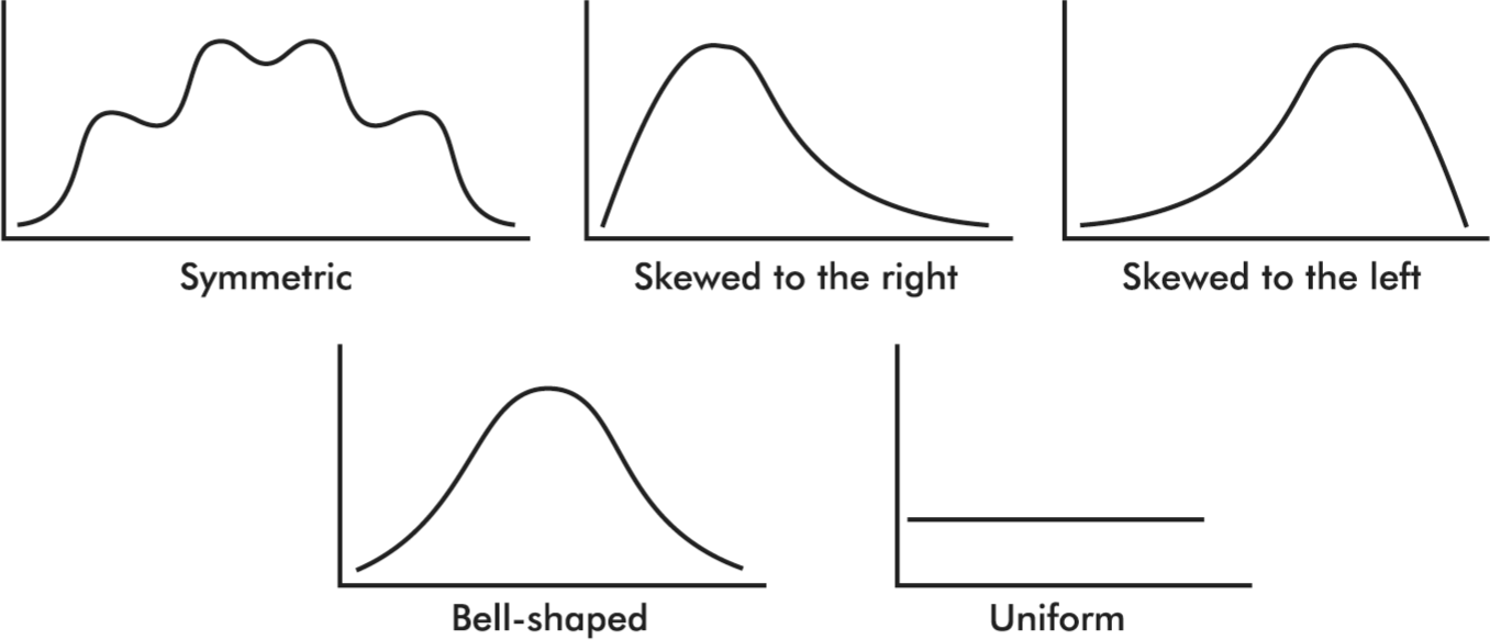
Distributions come in an endless variety of shapes; however, certain common patterns are worth special mention:
A distribution with one peak is called unimodal and a distribution with two peaks is called bimodal.
A symmetric distribution is one in which the two halves are mirror images of each other.
A distribution is skewed to the right if it spreads far and thinly toward the higher values.
A distribution is skewed to the left if it spreads far and thinly toward the lower values.
A bell-shaped distribution is symmetric with a center mound and two sloping tails.
A distribution is uniform if its histogram is a horizontal line.
Summary Statistics for a Quantitative Variable
Descriptive Statistics - The presentation of data, including summarizations and descriptions, and involving such concepts as representative or average values, measures of variability, positions of various values, and the shape of a distribution.
Inferential statistics - the process of drawing inferences from limited data, a subject discussed in later units.
Average has come to mean a representative score or a typical value or the center of a distribution.
Two primary ways of denoting the "center" of a distribution:
The median - which is the middle number of a set of numbers arranged in numerical order.
The mean - which is found by summing items in a set and dividing by the number of items.
➥ Example 1.4
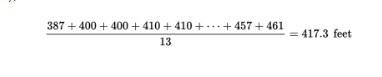
Consider the following set of home run distances (in feet) to center field in 13 ballparks: {387, 400, 400, 410, 410, 410, 414, 415, 420, 420, 421, 457, 461}. What is the average?
Solution: The median is 414 (there are six values below 414 and six values above), while the mean is
The arithmetic mean - is most important for statistical inference and analysis.
The mean of a whole population (the complete set of items of interest) is often denoted by the Greek letter µ (mu).
The mean of a sample (a part of a population) is often denoted by x̄.
➥ Example 1.5
Suppose the salaries of six employees are $3,000, $7,000, $15,000, $22,000, $23,000, and $38,000, respectively.
a. What is the mean salary?
b. What will the new mean salary be if everyone receives a $3000 increase?
c. What if instead everyone receives a 10% raise?
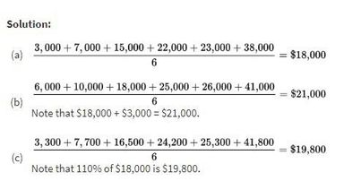
Example 1.5 illustrates how adding the same constant to each value increases the mean by the same amount. Similarly, multiplying each value by the same constant multiplies the mean by the same amount.
Variability - is the single most fundamental concept in statistics and is the key to understanding statistics.
Four primary ways of describing variability, or dispersion:
Range - the difference between the largest and smallest values, or maximum minus minimum.
Interquartile Range (IQR) - the difference between the largest and smallest values after removing the lower and upper quartiles (i.e., IQR is the range of the middle 50%); that is IQR = Q3 – Q1 = 75th percentile minus 25th percentile.
Variance - the average of the squared differences from the mean.
Standard Deviation - the square root of the variance. The standard deviation gives a typical distance that each value is away from the mean.
➥ Example 1.6
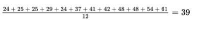
The ages of the 12 mathematics teachers at a high school are {24, 25, 25, 29, 34, 37, 41, 42, 48, 48, 54, 61}.
The mean is
What are the measures of variability?
Solution:
Range: Maximum minus minimum = 61 – 24 = 37 years
Interquartile range: Method 1: Remove the data that makes up the lower quarter {24, 25, 25} and the data that makes up the upper quarter {48, 54, 61}. This leaves the data from the middle two quarters {29, 34, 37, 41, 42, 48}. Subtract the minimum from the maximum of this set: 48 – 29 = 19 years.
Method 2: The median of the lower half of the data is 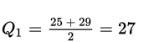
and the median of the upper half of the data is 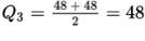
Subtract Q1 from Q3: 48 – 27 = 21 years.
Variance:
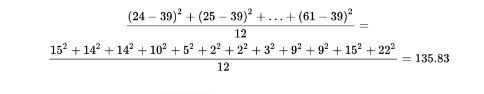
Standard Deviation:
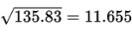
The mathematics teachers’ ages typically vary by about 11.655 years from the mean of 39 years.
Three important, recognized procedures for designating position:
Simple ranking - which involves arranging the elements in some order and noting where in that order a particular value falls.
Percentile ranking - which indicates what percentage of all values fall at or below the value under consideration.
The z-score - which states very specifically the number of standard deviations a particular value is above or below the mean.
Graphical Representations of Summary Statistics
The above distribution, spread thinly far to the low side, is said to be skewed to the left. Note that in this case the mean is usually less than the median. Similarly, a distribution spread thinly far to the high side is skewed to the right, and its mean is usually greater than its median.
➥ Example 1.7
Suppose that the faculty salaries at a college have a median of $82,500 and a mean of $88,700. What does this indicate about the shape of the distribution of the salaries?
Solution: The median is less than the mean, and so the salaries are probably skewed to the right. There are a few highly paid professors, with the bulk of the faculty at the lower end of the pay scale.
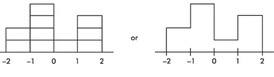
➥ Example 1.8
Suppose we are asked to construct a histogram from these data:
z-score: | –2 | –1 | 0 | 1 | 2 |
|---|---|---|---|---|---|
Percentile ranking: | 0 | 20 | 60 | 70 | 100 |
We note that the entire area is less than z-score +2 and greater than z-score −2. Also, 20% of the area is between z-scores −2 and −1, 40% is between −1 and 0, 10% is between 0 and 1, and 30% is between 1 and 2. Thus the histogram is as follows:
Now suppose we are given four in-between z-scores as well:
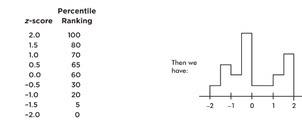
With 1,000 z-scores perhaps the histogram would look like:
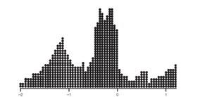
The height at any point is meaningless; what is important is relative areas.
In the final diagram above, what percentage of the area is between z-scores of +1 and +2?
What percent is to the left of 0?
Solution:
Still 30%.
Still 60%.
Comparing Distributions of a Quantitative Variable
Four examples showing comparisons involving back-to-back stemplots, side-by-side histograms, parallel boxplots, and cumulative frequency plots :
➥ Example 1.9
The numbers of wins for the 30 NBA teams at the end of the 2018–2019 season is shown in the following back-to-back stemplot.
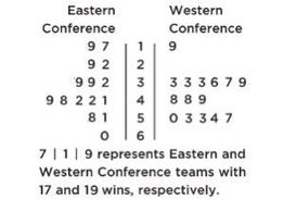
When comparing shape, center, spread, and unusual features, we have:
Shape: The distribution of wins in the Eastern Conference (EC) is roughly bell-shaped, while the distribution of wins in the Western Conference (WC) is roughly uniform with a low outlier.
Center: Counting values (8th out of 15) gives medians of mEC = 41 and mWC = 49. Thus, the WC distribution of wins has the greater center.
Spread: The range of the EC distribution of wins is 60 − 17 = 43, while the range of the WC distribution of wins is 57 − 19 = 38. Thus, the EC distribution of wins has the greater spread. Unusual features: The WC distribution has an apparent outlier at 19 and a gap between 19 and 33, which is different than the EC distribution that has no apparent outliers or gaps.
➥ Example 1.10
Two surveys, one of high school students and one of college students, asked students how many hours they sleep per night. The following histograms summarize the distributions.
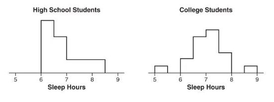
When comparing shape, center, spread, and unusual features, we have the following:
Shape: The distribution of sleep hours in the high school student distribution is skewed right, while the distribution of sleep hours in the college student distribution is unimodal and roughly symmetric.
Center: The median sleep hours for the high school students (between 6.5 and 7) is less than the median sleep hours for the college students (between 7 and 7.5).
Spread: The range of the college student sleep hour distribution is greater than the range of the high school student sleep hour distribution.
Unusual features: The college student sleep hour distribution has two distinct gaps, 5.5 to 6 and 8 to 8.5, and possible low and high outliers, while the high school student sleep hour distribution doesn’t clearly show possible gaps or outliers.
➥ Example 1.11
The following are parallel boxplots showing the daily price fluctuations of a particular common stock over the course of 5 years. What trends do the boxplots show?
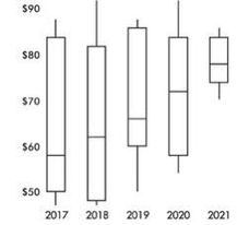
Solution: The parallel boxplots show that from year to year the median daily stock price has steadily risen 20 points from about $58 to about $78, the third quartile value has been roughly stable at about $84, the yearly low has never decreased from that of the previous year, and the interquartile range has never increased from one year to the next. Note that the lowest median stock price was in 2017, and the highest was in 2021. The smallest spread (as measured by the range) in stock prices was in 2021, and the largest was in 2018. None of the price distributions shows an outlier.
➥ Example 1.12
The graph below compares cumulative frequency plotted against age for the U.S. population in 1860 and in 1980.
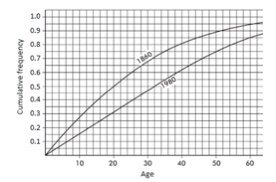
How do the medians and interquartile ranges compare?
Solution: Looking across from 0.5 on the vertical axis, we see that in 1860 half the population was under the age of 20, while in 1980 all the way up to age 32 must be included to encompass half the population. Looking across from 0.25 and 0.75 on the vertical axis, we see that for 1860, Q1 = 9 and Q3 = 35 and so the interquartile range is 35 − 9 = 26 years, while for 1980, Q1 = 16 and Q3 = 50 and so the interquartile range is 50 − 16 = 34 years. Thus, both the median and the interquartile range were greater in 1980 than in 1860.
The Normal Distribution
Normal distribution is valuable for providing a useful model in describing various natural phenomena. It can be used to describe the results of many sampling procedures.
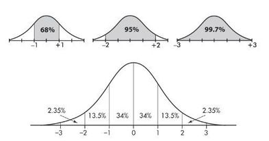
The normal distribution curve is bell-shaped and symmetric and has an infinite base.
The mean of a normal distribution is equal to the median and is located at the center. There is a point on each side where the slope is steepest. These two points are called points of inflection, and the distance from the mean to either point is precisely equal to one standard deviation. Thus, it is convenient to measure distances under the normal curve in terms of z-scores.
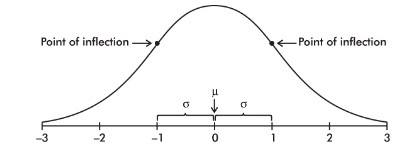
The empirical rule (also called the 68-95-99.7 rule) applies specifically to normal distributions. In this case, about 68% of the values lie within 1 standard deviation of the mean, about 95% of the values lie within 2 standard deviations of the mean, and about 99.7% of the values lie within 3 standard deviations of the mean.
➥ Example 1.13
Suppose that taxicabs in New York City are driven an average of 75,000 miles per year with a standard deviation of 12,000 miles. What information does the empirical rule give us?
Solution: Assuming that the distribution is roughly normal, we can conclude that approximately 68% of the taxis are driven between 63,000 and 87,000 miles per year, approximately 95% are driven between 51,000 and 99,000 miles, and virtually all are driven between 39,000 and 111,000 miles.