


AP Stats Unit 1: Exploring One-Variable Data (RECAP)
It is important to note that this is not an exhaustive recap of Unit 1: Exploring One-Variable Data, and all teachers teach differently (with their own unit names and contents). This recap is written based off the AP Classroom Daily Videos.
1.1: Introducing Statistics: What Can We Learn from Data?
Statistics can be divided into two areas:
Descriptive Statistics: A situation that has happened, and can be recorded through collecting data, organizing, summarizing, and drawing conclusions.
Data is defined by what it is recording, thus the five W’s
Who: consider who is being studied
What:
Independent variables: the thing you are changing in a situation
Dependent variables: the thing that is changing in response to what you changed in a situation
Controlled variables: things in a situation that are constant or unchanged through all conditions
When: General facts about the data collected that may set forth patterns. Ex: the cyclical nature of temperature
 (NASA’s global temperature graph, https://climate.nasa.gov/vital-signs/global-temperature/?intent=121)
Where: General facts about the data collected that may set forth patterns
Why (if possible): the reason data is being collected
Inferential Statistics: (Could be) A situation that hasn’t happened yet, but we make an inference from previous data by generalizing, estimating, testing, and using those to make predictions.
It is important to note there are different types of differential statistics
1.2: The Language of Variation: Variables
Variable: Characteristic that changes from one experimental unit/individual to another
Categorical Variable: takes on values that are category names or group labels (not literal numbers)
Quantitative Variable: numbers measuring or counting quantity of something (not literal categories or group labels)
Discrete Variable: a variable that can only give numbers with gaps (like 2 siblings, but not 2.5 siblings)
Continuous Variable: a variable that can have infinite numbers/values, like height, 5 foot 1 inch, 5 foot 1.1 inch, 5 foot 1.11 inch, etc. No gaps.
Individuals: people, animals, things, etc described by a dataset
1.3: Representing a Categorical Variable with Tables
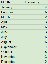
 Responses to an online survey asking 50 individuals, “What month were you born in?”
Frequency Table: gives the number of individuals in each category
 Relative Frequency Table: gives proportion or percent of individuals in each category
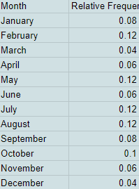
1.4: Representing a Categorical Variable with Graphs
Using the example from 1.3, we will use this table of 50 individuals who where asked, “What is your birth month?”
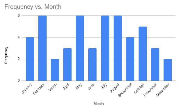 Bar Chart: represents categorical data, comparing values between groups of data
 Pie Chart: represents categorical data, with each slice representing a category
1.5: Representing a Quantitative Variable with Graphs
 (Don’t know source, this is just from College Board 1.5 Daily Video, where “city officials measured lead levels in 71 water samples from Flint residents in January to June 2015. Here are the data in parts per billion.”) (all graphs referencing this data are from 1.5 Daily Video)
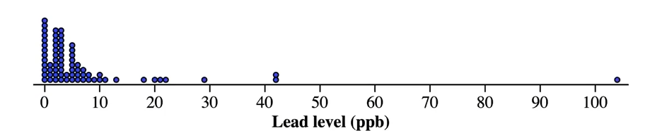 Dotplot: represents both categorical or quantitative data by using dots to indicate a value existing at the measurement on the axis
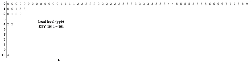 Stem and leaf plot: represents quantitative variables by having the “stem” (singular number typically to the left of the line) represent a larger value like the tens value, while the other side is the “leaf” representing a smaller number such as the ones place value.
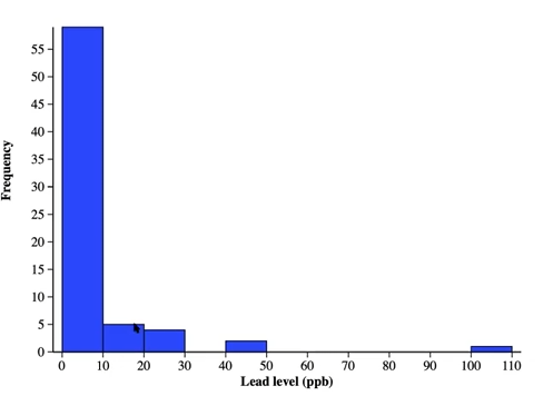 Histogram: represent quantitative data using frequencies, where each rectangles to the right of a number of the x axis represents the presence of a value between itself and the next number, minus 1. For instance, the first rectangle shows that the lead levels 0-9 ppb occur at a frequency of above 55%, likely around 60%
1.6: Describing the Distribution of a Quantitative Variable
Using the data from 1.5, we can use the acronym SOCS to describe the distribution of quantitative data
Shape: is used to describe the shape of a graph, generally 3 options
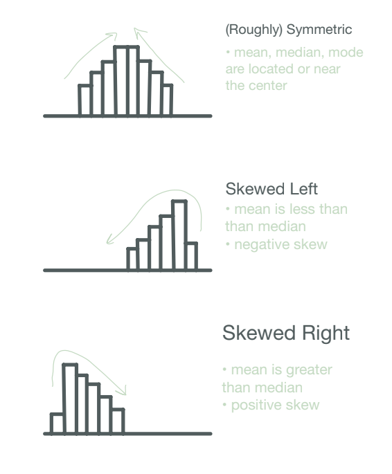
To remember where the mean in distributions, you can remember the phrase “mean chases the tail”
Outliers: A data point outside the normal range of the distribution
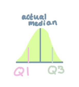
Outliers can be visually identified in graphs, but also calculated if you know the IQR (interquartile range) (the middle 50% of data), Q3, and Q1.
Calculate IQR by using (Q3-Q1), where Q3 is the median of the data of half of the data above the actual median, and Q1 is the median of the data of half of the data below the actual median.
Then, to calculate outliers, use (Q3-Q1) * 1.5 to get what we will call NewNum
Q1 - NewNum = Lower boundary for outlier
Q3 + NewNum = Upper boundary for outlier
Any data points outside these boundaries are outliers, and should be mentioned in the Outlier
Center: The median is the center of a distribution and can be found by using two equations
If the amount of values in a set are odd, then use (n-1)/2 and then go past that digit. So if n = 47, then (47-1)/2= 23, so the 24th value is the median
If the amount of values in a set are even, then use (n-2)/2 to find the units towards the middle you’ll be going towards, then take the average of the next two values.
Medians cannot be found in histograms, so find a range of the median.
Spread: A measure of the variability in the data. Typically, this will mean stating the range and standard deviation of the graph.
Range: can be found by subtracting the highest value data from the lowest value data.
Standard Deviation: is the average value away from the mean a random data point will be. Can be calculated with calculator or equation later explained.
To calculate with a Ti-nspire Cx, open “New Document” (1) → “Add Lists & Spreadsheets” (4) → Label the first cell on the X axis as X, then input your dataset values into the spreadsheet → Menu → “Statistics” (4) → “Stat Calculations” (1) → “One-Variable Statistics” (1) → Set num of lists to 1 → Set X1 list to ‘x (or whatever it may be, assuming you only have 1 column of data), keep frequency list to 1, and set result column to an empty space on your spreadsheet → Press Ok/Enter, then find the σ column (typically will be the 6th one down) and the column to the right of it will contain a number. That is your standard deviation.
1.7: Summary Statistics for a Quantitative Variable
Mean: Add all data points together, then divide by the number of data points that were added
Median: The middle of the data can be found by ordering all values of data from lowest to highest, then finding the middle data point.
Q1 and Q3: explained in 1.6
Range: explained in 1.6
Interquartile Range (IQR): explained in 1.6
1.8: Graphical Representations of Summary Statistics
A 4 or 5 point summary can be used to create a boxplot, detailed in this video,
as this is difficult to explain in text format
1.9: Comparing Distributions of a Quantitative Variable
To compare two distributions, SOCS can again be used, simply adding more info about how the two distributions differ or align
Shape: Are the shapes of the two distributions the same, or are they different? Which shape is each distribution?
Outliers: Do either of the distributions contain outliers? If so, which (if both) and what are these outliers?
Center: What is the center of these distributions, and are they different? Which is higher or lower?
Spread: What is the spread of both distributions, and is one wider or smaller than the other?
1.10: The Normal Distribution
 (Image courtesy of InchCalculator,)
A normal distribution is a roughly symmetric distribution, with the mean (µ) in the center, and each tick away from the center being plus or minus one standard deviation (σ)
It is important to note, the normal distribution does not often naturally occur, so approximately normal will suffice
Also, the normal distribution only goes about ±3σ away from the mean
68% of the data is contained within ±1σ of the mean
95% of the data is contained within ±2σ of the mean
99.7% of the data is contained within ±3σ of the mean
Z Score: is the amount of standard deviations a data point is above or below the mean/average. It can be found by using this equation: z=(X-µ)/σ, where X is the raw data point or the value you are converting, µ is the mean of the data set, and σ is the standard deviation of the data set
Percentile: the percent of data values less than or equal to a given value
You may be asked to calculate the area to the right, left, above, below, or in-between two spots on the normal curve
Good luck!
For supplementary material, there are many worksheets and free teachers online. Most importantly of all, remember not to lose yourself in the AP score data, you’re more than just a number ;).