


Chapter 1: Data Analysis
Introduction:
An Individual is a thing (person, animal, place, etc.) being studied in a data set. Columns in a data table
A Variable is an characteristic that holds information for different induvial. Rows in a data table
A Categorical Variable assigns labels that place each individual into a particular group, called a category
A Quantitative Variable takes number values that are quantities—counts or measurements.
GPA & Children in Family are examples of this
Grade Level, Homework Last Night, and other ranges are not quotative.
2 Types of Quotative Variables: Discrete & Continuous variables.
A Discrete Variable comes from counting something (like number of languages spoken).
A Continuous Variable comes from measuring something (like ones height).
A Distribution tells us how a variable is spread out and positioned.
Usually a distribution is in the form of a graph: … shows the distribution of left vs right handed people in a bar graph.
Usually a pattern in the data
1.1 Analyzing Categorical (Words) Data:
A Frequency Table shows how many times a value (individual) appears
Ex: 3 people got a 75% on a test
A Relative Frequency Table shows the pieces / percent(s) of each value (individual).
A Bar Graph shows each categorical variable as a bar. The bar’s heights shows the frequency.
Draw & label the axes: Categorical variables under horizontal axis, frequency on vertical axis.
“Scale” the axes: Write the names of the Categorical Variables & start at 0 for frequency.
Draw bars above category names: Correspond w/ frequency & leave gaps between bars
A Pie Chart shows each categorical variable as a slice of the “pie”, adding to 100%.
A Two-Way Table shows the relationship between two categorical variables (Columns like: No, Yes, Total)
A Joint Relative Frequency is the percent/proportion between 2 categorical variables.
Ex: Proportion of people in a club & use a car is 445/1526 = 0.292 = 29.2%
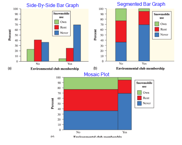
To compare the distribution (data) of categorical variables, use these graphs:
Side-By-Side Bar Graphs, Segmented Bar Graph, & Mosaic Plot.
They all pretty much do the same thing. See the image below.
An Association can help predict the outcome of one variable based on another variable.
1.2 Quantitive (Numerical) Data with Graphs
A Dotplot uses dots above a number line to show where each value is.
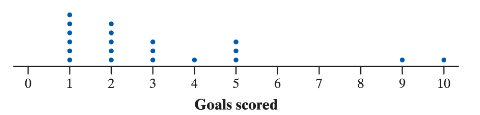
Graph Shape:
When looking at a graph (like a dotplot), look at it’s shape.
Ensure to look at it from a distance, ignore minor ups and downs
Describe if the graph is symmetric or is clearly skewed
Symmetric when the right side is a mirrorish of the left side.
Skewed to Right when “bump” is to left & “tail” faces right
Skewed to Left when “bump” is to right & “tail” faces left
The direction of skewedness is towards the long tail, not where there is large clusters.
Quantitive Distributions:
Remember: A distribution is how a variable is spread out and positioned.
To Find a Distribution look for an overall pattern by its shape, outliers, center, and variability.
Shape: Symmetric, Skewed Left, or Skewed Right
Outliers: Should Be Ignored when describing
Center: Mean or Median
If shape is Skewed or has Outliers, use Median
if shape is Symmetric, use mean
Variability: Range, IQR (Q3 - Q1), or Standard Deviation
Other Graphs:
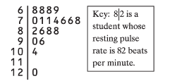
Stemplots (Aka Stem & Leaf Plots) shows data separated in two parts: stem & leaf (1st Image)
Stem is everything but the 1st digit, leaf is the final digit.
Make sure to have a key! Ex: 8|2 = 82 beats per minuet
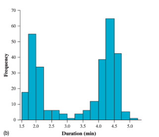
Histograms show each inverval values as a bar graph (2nd Image)
This is useful since there’s usually a lot of data points, and histograms reduce the number of bars that will be present on the graph.
Basically a bar graph but with a range.
1.3 Describing Quantitive Data with Numbers
Best way to measure center is using its mean
The Mean is the average of the individual data values
To find the mean, add all the values and divide by the total number of data values
A Statistic is a number that describes a characteristic of a sample
A Parameter is a number that describes some characteristic of a population
A statistic measurement is Resistant when not sensitive to outliers.
The Median is the midpoint of a distribution
Mean < Median when Shape is Skewed Left
Mean > Median when Shape is Skewed Right
Mean = Median when Shape is Symmetric
The Range is the distance between the minimum and maximum value in the data
Range is useful since sometimes the shape and center can be the same.
Standard Deviation measures variance (Q1 & Q3) from the mean (Q2)
Find the mean
Calculate the deviation of each value: deviation = value - mean
Square and add all the deviations
Divide the answer by n - 1 (Where n is the number of values)
Take the square root of the answer
The Variance is the Standard Deviation squared
The Interquartile Range (IQR) measures the distance between the 3rd quartile and 1st quartile.
Formula: IQR = Q3 - Q1
Q1 is the median for the first half of the data min → Q2 (Median)
Q2 is the median of the entire data set min → max
Q3 is the median for the last half of the data Q2 → max
The 1.5 * IQR Rule provides a mathematical way to find outliers
Low Outliers < Q1 - 1.5 * IQR
High Outliers > Q3 + 1.5 * IQR
If the result of the inequality is true, an outlier exists.