


Chapter 2: Descriptive Statistics
2.1 Stem-and-Leaf Graphs (Stemplots), Line Graphs, and Bar Graphs
Stem-and-leaf graph or stemplot: easy to compute the median and other quantiles. Each data point is converted into stem and leaf, e.g., 438 (stem: 43; leaf: 8)
Outlier: an observation that does not fit the rest of the data
Line graph: A graph used to show changes over time
X-axis: this is the explanatory variable
Data values: the content that fills a space in a record
Y-axis: the response variable
Frequency: the number of times a value of the data occurs
Bar graphs: used to display grouped data or categorical data; the identity of the sample points within the respective groups is lost
2.2 Histograms, Frequency Polygons, and Time Series Graphs
Histogram: a graphical representation in the x-y form of the distribution of data in a data set; x represents the data and y represents the frequency or relative frequency. The graph consists of contiguous rectangles.
Frequency Polygons: looks like a line graph but uses intervals to display ranges of large amounts of data
Convenient starting point: a lower value carried out to one more decimal place than the value with the most decimal places
Discrete data: type of data that includes whole, concrete numbers with specific and fixed data values determined by counting
Paired data set: two data sets that have a one-to-one relationship so that:
Calculator Steps to Create a Histogram (calculator steps)
Press Y=. Press CLEAR to delete any equations.
Press STAT 1:EDIT. If L1 has data in it, arrow up into the name L1, press CLEAR, and then arrow down. If necessary, do the same for L2.
Into L1, enter 1, 2, 3, 4, 5, 6.
Into L2, enter 11, 10, 16, 6, 5, 2.
Press WINDOW. Set Xmin = .5, Xmax = 6.5, Xscl = (6.5 – .5)/6, Ymin = –1, Ymax = 20, Yscl = 1, Xres = 1.
Press 2nd Y=. Start by pressing 4:Plotsoff ENTER.
Press 2nd Y=. Press 1:Plot1. Press ENTER. Arrow down to TYPE. Arrow to the 3rd picture (histogram). Press ENTER.
Arrow down to Xlist: Enter L1 (2nd 1). Arrow down to Freq. Enter L2 (2nd 2).
Press GRAPH.
Use the TRACE key and the arrow keys to examine the histogram
2.3 Measures of the Location of the Data
Quartiles:the numbers that separate the data into quarters; may or may not be part of the data
Percentiles: a number that divides ordered data into hundredths
First quartile: the value that is the median of the lower half of the ordered data set
Interquartile range: is the range of the middle 50 percent of the data values; found by subtracting the first quartile from the third quartile.
IQR = Q3 - Q1
Smaller outlier: Q1 - IQR(1.5)
Larger outlier: Q2 - IQR(1.5)
The Formula for Finding the kth Percentile
k: the kth percentile. It may or may not be part of the data.
i: the index (ranking or position of a data value)
n: the total number of data
kth percentile: i = (k/100)(n + 1)
A Formula for Finding the Percentile of a Value in a Data Set
x: the number of data values counting from the bottom of the data list up to but not including the data value for which you want to find the percentile.
y: the number of data values equal to the data value for which you want to find the percentile.
n: the total number of data.
Formula for percentile: x + (0.5y/n) (100)
2.4 Box Plots
Box plots: a graph that gives a quick picture of the middle 50% of the data
Finding the minimum, maximum, and quartiles (calculator steps)
Enter data into the list editor (Pres STAT 1:EDIT). If you need to clear the list, arrow up to the name L1, press CLEAR and then arrow down.
Put the data values into the list L1.
Press STAT and arrow to CALC. Press 1:1-VarStats. Enter L1.
Press ENTER.
Use the down and up arrow keys to scroll.
Constructing a Box Plot (calculator steps)
Press 4:Plotsoff. Press ENTER.
Arrow down and then use the right arrow key to go to the fifth picture, which is the box plot. Press ENTER.
Arrow down to Xlist: Press 2nd 1 for L1
Arrow down to Freq: Press ALPHA. Press 1.
Press Zoom. Press 9: ZoomStat.
Press TRACE, and use the arrow keys to examine the box plot
2.5 Measures of the Center of the Data
Mean: a number that measures the central tendency of the data; a common name it is 'average.'
Median: a number that separates ordered data into halves
The sample mean: The average number of the sample
Population mean: The average number of the population.
Mode: The value that appears most often in a set of data.
The Law of Large Numbers: if you take samples of larger and larger size from any population, then the mean x of the sample is very likely to get closer and closer to µ.
Sampling distribution: a probability distribution of a statistic that comes from choosing random samples of a given population
Relative frequency distribution: the ratio of the number of times a value of the data occurs in the set of all outcomes to the number of all outcomes
Relative frequency table: a data representation in which grouped data is displayed along with the corresponding frequencies
Finding mean and median (calculator steps)
Clear list L1. Pres STAT 4:ClrList. Enter 2nd 1 for list L1. Press ENTER.
Enter data into the list editor. Press STAT 1:EDIT.
Put the data values into list L1.
Press STAT and arrow to CALC. Press 1:1-VarStats. Press 2nd 1 for L1 and then ENTER.
Press the down and up arrow keys to scroll.
2.6 Skewness and the Mean, Median, and Mode
Symmetrical: a figure or shape that can be divided into two equal parts by a line
Skewed to the left: the graph is pulled out to the left.
Skewed to the right: the graph is pulled out to the right.
2.7 Measures of the Spread of the Data
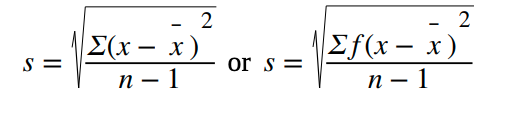
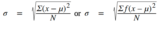
Standard deviation: a number that is equal to the square root of the variance and measures how far data values are from their mean
Variance: average of the squares of the deviation
Formulas for the Standard Deviation
Sampling Variability of Statistic
Sampling variability: the observed value of a statistic depending on the particular sample selected from the population and it will vary from sample to sample
Standard error of the mean: indicates how different the population means is likely to be from a sample mean.
The central limit theorem: states that the distribution of sample means approximates a normal distribution as the sample size gets larger.