
Chapter 2 - Exploring Data with Tables & Graphs
2-1 Frequency Distributions for Organizing and Summarizing Data
Frequency distribution (or frequency table) shows how data are partitioned among several categories (or classes) by listing the categories along with the number (frequency) of data values in each of them.
The frequency for a particular class is the number of original values that fall into that class.
Lower class limits are the SMALLEST numbers that can belong to each of the different classes, whereas upper class limits are the LARGEST numbers that can belong to each of the different classes.
Class boundaries are the numbers used to separate the classes, but without the gaps created by class limits.
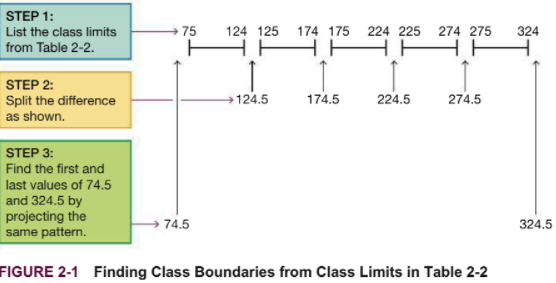
Class midpoints are the values in the middle of the classes.
Class width is the difference between 2 consecutive lower class limits (or 2 consecutive lower class boundaries) in a frequency distribution.
CAUTION: the class width is not just the difference between a lower class limit and an upper class limit, you must also +1.
Why we construct frequency distributions:
Summarize large data sets
See the distribution and identify outliers
Have a basis for constructing graphs (such as histograms)
Procedure for constructing a frequency distribution:
Select the number of classes, usually between 5 and 20.
Calculate the class width. Round the below result to get a convenient number (usually round up)
Choose the value for the 1st lower class limit by either using the minimum value or a convenient value below the minimum.
Using the first lower class limit and the class width, list the other lower class limits (add the class width to the 1st lower class limit to get the second lower class limit, etc.)
List the lower class limits in a vertical column and then determine and enter the upper class limits.
Take each individual data value and put a tally mark in the appropriate class. Add the tally marks to find the total frequency for each class.
When constructing a frequency distribution, make sure classes do not overlap.
The relative frequency distribution, or percentage frequency distribution, is a variation of the basic frequency distribution.
Relative frequency for a class = frequency of a class / sum of all frequencies
Percentage for a class = (frequency of a class / sum of all frequencies) * 100
The sum of the percentages in a relative frequency distribution must be VERY CLOSE TO 100%.
The cumulative frequency distribution is another variation of a frequency distribution, in which the frequency for each class is the sum of the frequencies for that class and all previous classes.
Class limits are replaced by "less than" expressions that describe the new range of values.
Normal Distribution features
Frequencies start low, and then increase to one or two high frequencies, and then decrease back to a low frequency.
The distribution is approximately symmetric. Frequencies preceding the maximum frequency should be roughly a mirror image of those that follow the maximum frequency.
Judgement needs to be used to determine if a data set matches these conditions as real data is not perfect.
Analysis of the frequency of last digits can sometimes be used to reveal how the data was collected or measured.
Ex: If the last digit of frequencies are all even numbers in a beats per minute data set, this may indicate that in fact the beats were only counted for 30 seconds, then doubled.
Gaps: May indicate that a data set came from two or more different populations. This principle does not work in reverse.
2-2 Histograms
Histograms are graphs consisting of bars of equal width drawn adjacent to each other (Except for gaps). A horizontal scale represents the classes of quantitative data values, while the vertical scale represents frequencies. The height of the bar corresponds to the frequency. (Basically a graph of frequency distribution)
Uses of histograms:
Visually shows the shape of the data distribution
Shows the location of the center of the data
Shows the spread of data
Identifies outliers
Values for the bar locations on the horizontal score are usually class boundaries, class midpoints, or class limits, etc., although there is no universal agreement on what to use. (Class midpoints are usually the easiest to use for the horizontal scale)
Relative frequency histogram uses the same shape/horizontal scale as a regular histogram, but uses relative frequencies for the vertical scale (percentages or proportions) as opposed to actual frequencies
Common distribution shapes:
Green - Bell-shaped (Normal) distribution
Red - Uniform distribution
Light blue - Skewed to the right
Brown - Skewed to the left
Skewness - Data is skewed if the distribution is not symmetric and extends more to one side than the other
Skewed to the right = Positively skewed = Longer right tail
Skewed to the left = Negatively skewed = Longer left tail
Data is more commonly skewed to the right
Criteria for normal distribution
The pattern of points in the normal quartile plot are reasonably close to a straight line
Points do have some symmetrical pattern that is a straight line.
not
not
Back-to-back relative frequency histogram - Format that makes comparison between histograms much easier. (Relative frequencies should be used in comparisons to avoid problems with different sample sizes)
2-3 Graphs that Enlighten and Graphs that Deceive
Dotplots are graphs of quantitative data where each data value is plotted as a point or dot above a horizontal scale of values. If two values are the same, the dots are stacked.
Features of a dotplot
Displays the shape of the data distribution
Usually possible to recreate the original list of data values
Stemplots represent quantitative data by separating each value into two parts. They can be expanded or condensed into more or fewer rows, and better stemplots can be obtained by rounding the original data values.
Stem - Leftmost digit
Leaf - Rightmost digit
Features of stemplots
Shows the shape of the distribution of the data
Retains original data values
Sample data are sorted (arranged in order)
Stems can be combined to form a single stem (Condensed) or divided into multiple stems (Expanded)
Time-Series Graphs are graphs of time-series data, which are quantitative data that have been collected at different points in time (Ex: monthly or yearly)
Reveals information about trends over time
Bar graphs use bars of equal width to show frequencies of categories of categorical/qualitative data. May have small gaps between bars
Shows the relative distribution of categorical data, making it easier to compare to different categories.
Pareto charts are bar graphs for categorical data, but have bars that are arranged in by frequency (height decreases from left to right)
descending order
Shows the relative distribution of categorical data making it easier to compare
Draws attention to the more important categories.
Pie Charts depict categorical data as slices in a circle, with each slice proportional to the frequency count for that category.
Show the categorical data distribution in a commonly used format
Not as useful as other charts because they lack a proper scale
Frequency polygons utilize line segments connected to points located above the class midpoint values.
Relative frequency polygon: Uses relative frequencies for the vertical scale.
Two or more can be combined on a single graph for easy comparisons.
Common ways deceptive and misleading graphs are made
Nonzero vertical axis - Used to exaggerate differences between groups
Pictographs (drawings of objects) - Can also distort differences (Ex: Doubling the side of a square quadruples the area)
Graphing principles outlined by Edward Tufte
Small data sets with 20 values of fewer should use a table instead of a graph
Graphs should focus on the true nature of the data
Do not distort data, use an appropriate graph
2-4 Scatterplots, Correlation, and Regression
Correlation exists between two variables when the values of one variable are associated with values of the other variable
Linear correlation occurs when the correlation and plotted points of paired data result in a pattern with a straight line approximation
Scatterplot (scatter diagram) have a horizontal x-axis and vertical y-axis, with quantitative data.
Correlation does not imply causality.
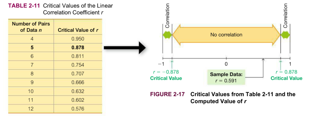
**Linear correlation coefficient (r)**measures the strength of the linear association between two variables.
Always between -1 and 1
If the value is close to -1 or 1, it indicates a strong linear correlation.
If the value is close to 0, there is little linear correlation.
If r lies between the critical values, there is no linear correlation
If r lies beyond the critical values in the tail of the table values, there is linear correlation
P-value
If there is no linear correlation between variables, the p-value is the probability of getting paired sample data with a linear correlation coefficient r that is at least as extreme as the one obtained from the paired sample data
The smaller the p-value, the likelier it is that there is linear correlation between the two variables.
Ex: A p-value of 0.05 indicates there is a 5% chance or less for the sample results to occur without any linear correlation
Regression
A regression line (line of best fit, least-squares line) is the straight line that best fits the scatterplot of the data.
Regression Equation: $y = b_0 + b_1x$