

Unit 4: Exploring Data
Introduction
Statistics: The science of data
Used to make estimates about unknowns and make decisions
Used to draw up conclusions about data
Collecting Data
Descriptive methods: The different methods used collect data. Can result in different outcomes and different conclusions.
Types of Variables and Descriptive Methods
Categorical or Qualitative: Places the individual being studied into one of several groups. (Ex. gender or eye color)
Numerical or Qualitative: Outcomes can be measured arithmetically. (Ex. age, height, etc.)
Discrete:
Continuous:
Univariate data: Taking only one measurement on each object (Ex. measuring the heights of a group of children)
Bivariate data: Taking two measurements on each object (Ex. Measuring heights and weights of a group of children)
Tabular Methods: Frequency distribution table (it facilitates the analysis of patterns of variation among observed data)
n: Denotes the number of observations
**Frequency (**f): Number of times that observation has occurred
Relative frequency: Ratio of the frequency to the total number of observations.
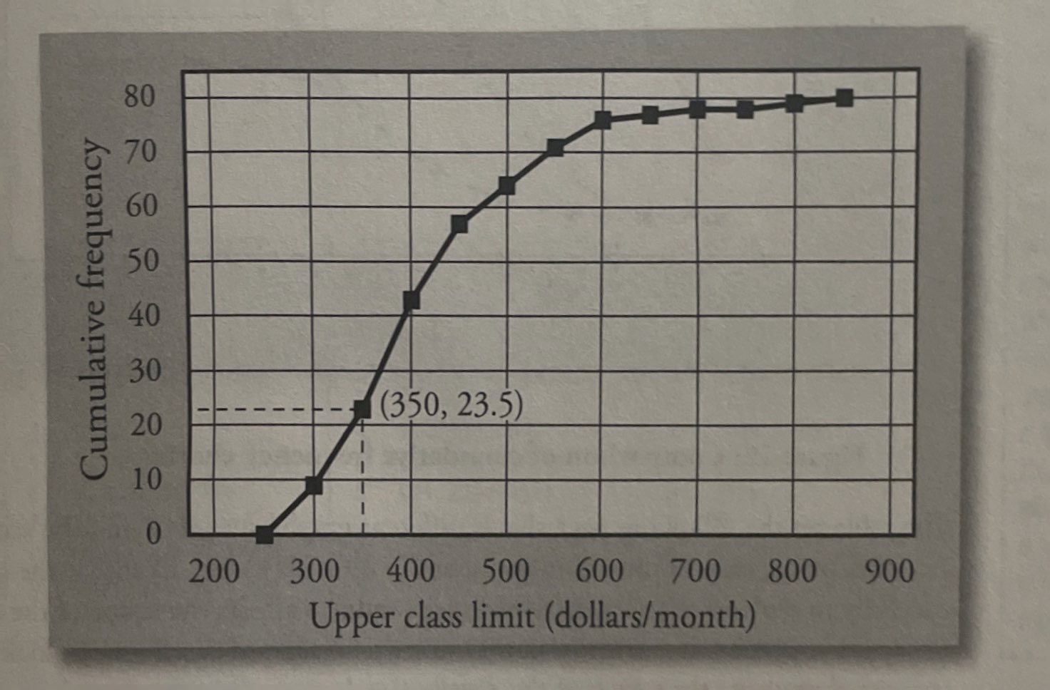
Cumulative frequency: Gives the number of observations less than or equal to a specific value
Frequency distribution table: A table giving all possible values of a variable and their frequencies
Graphical Methods for Qualitative Data
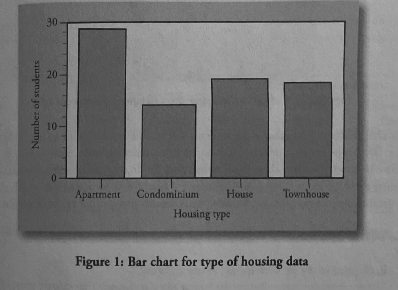
Bar Charts: The length of the bar for each category is proportional to the number or percent of individuals in each category.
Pie Chart: Categories of data are represented by wedges in a circle and are proportional in size to the percentage of individuals in each category

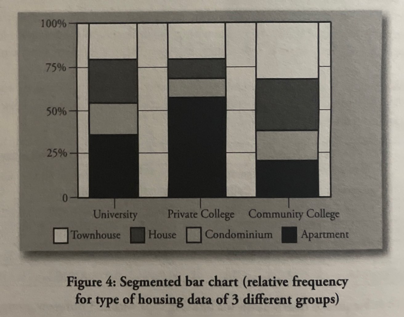
Segmented Bar Chart: Takes the distribution from each group and arranges them along either the horizontal or vertical axis and shows the relative frequency of each group represented in one bar for each group.
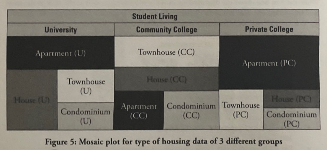
Mosaic Plots: Stacked bar chart that shows percentages of data in groups. An alternative way to compare groups of categorical data distributions.
Graphical Methods for Quantitative Data
Examining Graphs
Center: Describes the “typical” or central data points.
Spread: Describes how far the data points are from the center. Can be qualified through the range, standard deviation, or variance of a distribution
Shape: Distribution can tell us where most of the data is
Symmetrical Distribution: The data is spread out in the same way on both sides and there is the same amount of data on each side of the center
Skewed Distribution: If there is an extreme value in only one direction that causes one side to have a longer tail.
Patterns and Deviation from Patterns
Cluster sample: A sample in which the researcher first divides the population into sections (or clusters), and then randomly selects all members from some of those clusters.
Outliers: An observation that is surprisingly different from the rest of the data.
Graphical Methods for Continuous Variables
Stem-and-leaf graph or stemplot: easy to compute the median and other quantiles. Each data point is converted into stem and leaf, e.g., 438 (stem: 43; leaf: 8)

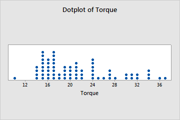
Dotplot: Best for small data sets, similar to histograms and bar plots
Histogram: a graphical representation in the x-y form of the distribution of data in a data set; x represents the data and y represents the frequency or relative frequency. The graph consists of contiguous rectangles.

Cumulative Frequency Charts: Frequency for that group plus the frequencies of all groups of small observations.
Summarizing Distribution
Population: The entire group of individuals or things that we are interested in.
Sample: The part of the population that is actually studied
Measures of Central Tendency, Variation, and Position
Mean: The arithmetic means AKA average. It is the most commonly used measure of the center of a set of data
Population mean: Adding up all the values in the entire population and dividing by the number of values.
Median: Point that divides the measurements in half.
Range: The difference between the largest and the smallest measurement in a data set.
R = range = largest measurement - smallest measurement
Interquartile range: The range of the middle 50% of the data, the difference between the third quartile and the first quartile.
IQR = Q3 - Q1
Standard deviation: A number that is equal to the square root of the variance and measures how far data values are from their mean
Variance: Average of the squares of the deviation
Percentiles: Percentiles divide a set of values into 100 equal parts.
Quartiles: Divide a set of values into four equal parts by using the 25th, 50th, and 75th.
Q1: 25% of values are below and 75% of values are above
Q2: 50% of the values are below and 50% of the values are above
Q3: 75% of values are below and 25% of values are above
Standardized scores or z-scores: Gives the distance between the measurements and the mean in terms of the number of standard deviations.
Negative z-score: Indicated that the measurements are smaller than the mean
Positive z-score: Indicates that the measurement is larger than the mean.
Graphing Univariate Data
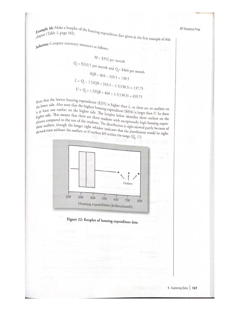
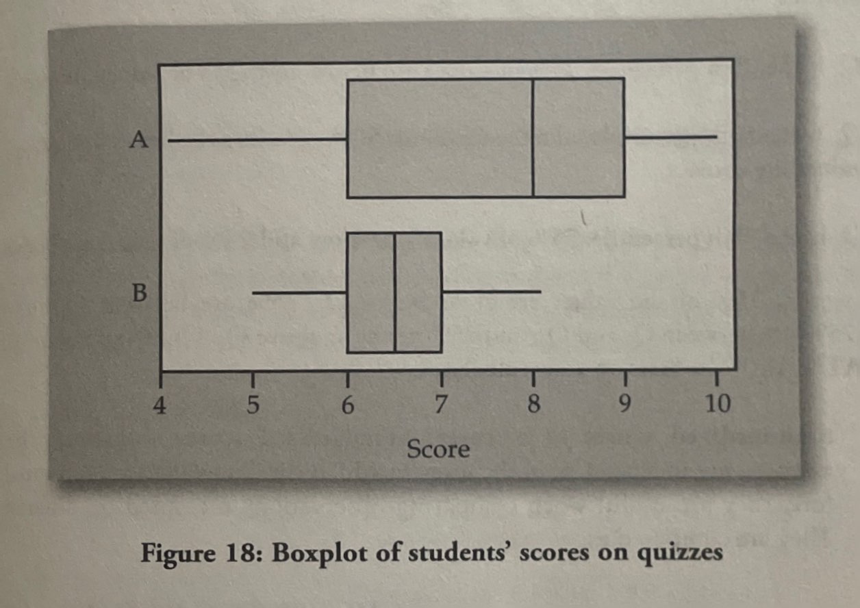
Box plots: a graph that gives a quick picture of the middle 50% of the data
Exploring Bivariate Data
Bivariate data: Data on two different variables collected from each item in a study:
Linear Regression: If two different qualitative variables have a linear relation, then we can measure the strength of that relationship using this.
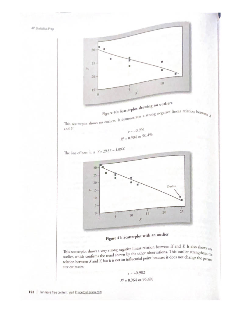
Scatterplot: Graphical summary measure. Describes the nature, degree, and direction of the relation between two variables.
Shape: A scatter plot tells us whether the nature of the relation between the two variables in linear or nonlinear
Direction: The scatterplot will show whether the y-value increases or decreases as the x increases, or that it changes direction
Positive relation: Increasing or upward trend between two variables
Negative relation: Decreasing or downward trend between the two variables
Strength of relationship: If the trend of the data can be described with a line of the curve then the spread of the data values around the line or curve describes the degree of the relation between the two
Correlation Coefficient: Numerical measures used to judge the relation between two variables
Least Squares Regression Line
Linear regression mode: Is an equation that gives a straight-line relationship between two variables
y = a + bx
Independent variable: x
Dependent variable: y
Slope: b
y-intercept: a
Predicted value: computed using the estimated regression line and is also known as “y hat”
Least square regression line: line that minimizes the sum of the squares of the residuals.
Coefficient of determination: measures the percent of the variation in Y-values explained by the linear relation between X- and Y-values.
Outliers and Influential Points
Outliers: are observed data points that are far from the least squares line.
Influential points: observed data points that are far from the other observed data points in the horizontal direction. These points may have a big effect on the slope of the regression line.
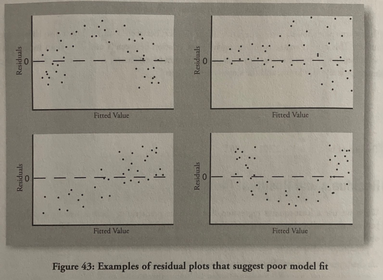
Residual and Residual Plots
Residual plots: Plot of residuals versus the predicted values of Y.
Error or residual = e = y - ŷ = observed values of Y for a given value of X - predicted value of Y for a given value of X
Calculator Steps
Calculator Steps to Create a Histogram
Press Y=. Press CLEAR to delete any equations.
Press STAT 1:EDIT. If L1 has data in it, arrow up into the name L1, press CLEAR, and then arrow down. If necessary, do the same for L2.
Into L1, enter 1, 2, 3, 4, 5, 6.
Into L2, enter 11, 10, 16, 6, 5, 2.
Press WINDOW. Set Xmin = .5, Xmax = 6.5, Xscl = (6.5 – .5)/6, Ymin = –1, Ymax = 20, Yscl = 1, Xres = 1.
Press 2nd Y=. Start by pressing 4:Plotsoff ENTER.
Press 2nd Y=. Press 1:Plot1. Press ENTER. Arrow down to TYPE. Arrow to the 3rd picture (histogram). Press ENTER.
Arrow down to Xlist: Enter L1 (2nd 1). Arrow down to Freq. Enter L2 (2nd 2).
Press GRAPH.
Use the TRACE key and the arrow keys to examine the histogram
Finding the minimum, maximum, and quartiles (calculator steps)
Enter data into the list editor (Pres STAT 1:EDIT). If you need to clear the list, arrow up to the name L1, press CLEAR and then arrow down.
Put the data values into the list L1.
Press STAT and arrow to CALC. Press 1:1-VarStats. Enter L1.
Press ENTER.
Use the down and up arrow keys to scroll.
Constructing a Box Plot (calculator steps)
Press 4:Plotsoff. Press ENTER.
Arrow down and then use the right arrow key to go to the fifth picture, which is the box plot. Press ENTER.
Arrow down to Xlist: Press 2nd 1 for L1
Arrow down to Freq: Press ALPHA. Press 1.
Press Zoom. Press 9: ZoomStat.
Press TRACE, and use the arrow keys to examine the box plot
Finding mean and median (calculator steps)
Clear list L1. Pres STAT 4:ClrList. Enter 2nd 1 for list L1. Press ENTER.
Enter data into the list editor. Press STAT 1:EDIT.
Put the data values into list L1.
Press STAT and arrow to CALC. Press 1:1-VarStats. Press 2nd 1 for L1 and then ENTER.
Press the down and up arrow keys to scroll.
Calculator steps for scatter plot
Enter your X data into list L1 and your Y data into list L2.
Press 2nd STATPLOT ENTER to use Plot 1. On the input screen for PLOT 1, highlight On and press ENTER. (Make sure the other plots are OFF.)
For TYPE: highlight the first icon, the scatter plot, and press ENTER.
For X List, enter L1 ENTER and for Ylist: L2 ENTER.
For Mark: it does not matter which symbol you highlight, but the square is the easiest to see. Press ENTER.
Make sure there are no other equations that could be plotted. Press Y = and clear any equations out.
Press the ZOOM key and then the number 9 (for menu item "ZoomStat"); the calculator will fit the window to the data. You can press WINDOW to see the scaling of the axes.