Humans produce sweat as a cooling mechanism to maintain a stable internal temperature. Which of the following best explains how the properties of water contribute to this physiological process?
A: The high specific heat capacity of water allows the body to absorb a large amount of excess heat energy.
B: The high heat of vaporization of water allows the body to remove excess heat through a phase change of water from liquid to gas.
C: The high surface tension of water contributes to the physical process by which water leaves the body.
D: The high melting temperature of water allows the body to remove excess heat through a phase change of water from solid to liquid.
B: The high heat of vaporization of water allows the body to remove excess heat through a phase change of water from liquid to gas.
A student placed a semipermeable membrane inside a U-shaped channel with two chambers, as shown. The membrane permits the movement of water but not salt. The student wants to vary the rate of osmosis that occurs across the membrane. Which of the following experimental designs will result in the fastest net rate of water movement into chamber A?
A: Placing salt water in chamber A and distilled water in chamber B
B: Placing distilled water in both chambers
C: Placing distilled water in chamber A and salt water in chamber B
D: Placing salt water in both chambers
A: Placing salt water in chamber A and distilled water in chamber B
Which of the following best describes the role of water in photosynthesis?
A: Water is the only source of protons for the formation of a proton gradient.
B: Water molecules donate electrons to the electron transport chain.
C: Water molecules combine with stored carbon molecules to produce glucose.
D: Water is the terminal electron acceptor for electrons that pass through the electron transport chain.
B: Water molecules donate electrons to the electron transport chain.
What evolutionary advantage does compartmentalization of core metabolic processes offer eukaryotes?
A: Evolution of the mitochondria allowed eukaryotes to perform respiration.
B: With the evolution of mitochondria in eukaryotes, the Krebs cycle and electron transport chain also evolved.
C: Evolution of a nucleus in eukaryotes separates the processes of transcription and translation and they can be regulated separately.
D: A nucleus in bacteria provides separation of respiration from transcription.
C: Evolution of a nucleus in eukaryotes separates the processes of transcription and translation and they can be regulated separately.
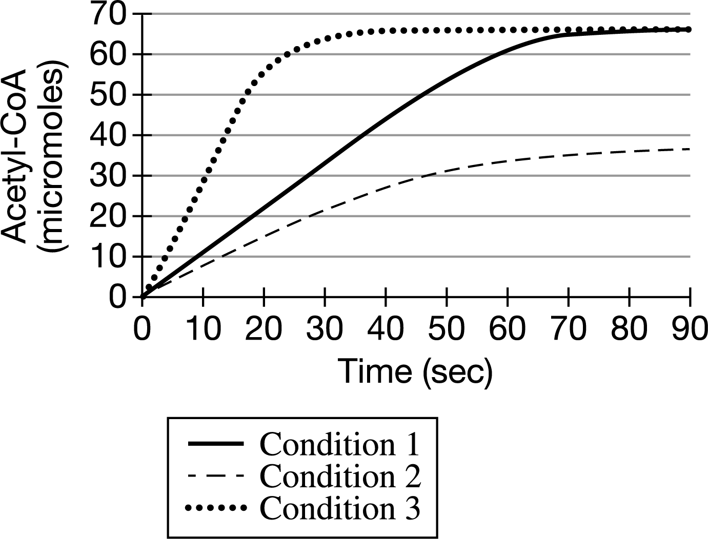
Pyruvate dehydrogenase is an enzyme that converts pyruvate to acetyl-CoA. Acetyl-CoA is further metabolized in the Krebs cycle. A researcher measured the accumulation of acetyl-CoA in a reaction containing pyruvate and pyruvate dehydrogenase under several different conditions (Figure 1).
Figure 1. Accumulation of acetyl-CoA under different conditions
Which of the following best describes the cellular location where pyruvate dehydrogenase is most likely active?
A: The Cytosol
B: The lysosomes
C: The nucleus
D: The mitochondrial matrix
D: The mitochondrial matrix
Pyruvate dehydrogenase is an enzyme that converts pyruvate to acetyl-CoA. Acetyl-CoA is further metabolized in the Krebs cycle. A researcher measured the accumulation of acetyl-CoA in a reaction containing pyruvate and pyruvate dehydrogenase under several different conditions (Figure 1).
Figure 1. Accumulation of acetyl-CoA under different conditions
The maximum production rate of acetyl-CoA under condition 1 is closest to which of the following?
A: 1 micromole / sec
B: 24 micromole / sec
C: 35 micromole / sec
D: 65 micromole / sec
A: 1 micromole / sec
Pyruvate dehydrogenase is an enzyme that converts pyruvate to acetyl-CoA. Acetyl-CoA is further metabolized in the Krebs cycle. A researcher measured the accumulation of acetyl-CoA in a reaction containing pyruvate and pyruvate dehydrogenase under several different conditions (Figure 1).
Figure 1. Accumulation of acetyl-CoA under different conditions
Which of the following observations provides the best evidence that acetyl-CoA negatively regulates pyruvate dehydrogenase activity?
A: The rate of the pyruvate dehydrogenase–catalyzed reaction is slower in the presence of a higher concentration of acetyl-CoA.
B:The gene that encodes pyruvate dehydrogenase is transcribed when excess acetyl-CoA is detected.
C: The accumulation of acetyl-CoA stops after 70 seconds, regardless of the reaction mixture.
D: Acetyl-CoA is continuously broken down in the Krebs cycle.z
A: The rate of the pyruvate dehydrogenase–catalyzed reaction is slower in the presence of a higher concentration of acetyl-CoA.
Pyruvate dehydrogenase is an enzyme that converts pyruvate to acetyl-CoA. Acetyl-CoA is further metabolized in the Krebs cycle. A researcher measured the accumulation of acetyl-CoA in a reaction containing pyruvate and pyruvate dehydrogenase under several different conditions (Figure 1).
Figure 1. Accumulation of acetyl-CoA under different conditions
Pyruvate dehydrogenase deficiency is a genetic disease most commonly linked to a mutation in the 𝛼-subunit of the mitochondrial enzyme that causes the enzyme to cease functioning. As a result of the mutation, affected individuals build up dangerous amounts of lactic acid. Which of the following best explains the buildup of lactic acid in individuals with the mutation?
A: Cells use lactic acid to shunt electrons from pyruvate to the electron transport chain in the mitochondria.
B: Cells undergo glycolysis because there is a buildup of pyruvate in affected individuals.
C: Cells cannot transport pyruvate to the mitochondria in the absence of pyruvate dehydrogenase activity, so the pyruvate is broken down to lactic acid and ethanol.
D: Cells undergo fermentation because pyruvate cannot be metabolized to proceed into the Krebs cycle.
D: Cells undergo fermentation because pyruvate cannot be metabolized to proceed into the Krebs cycle.
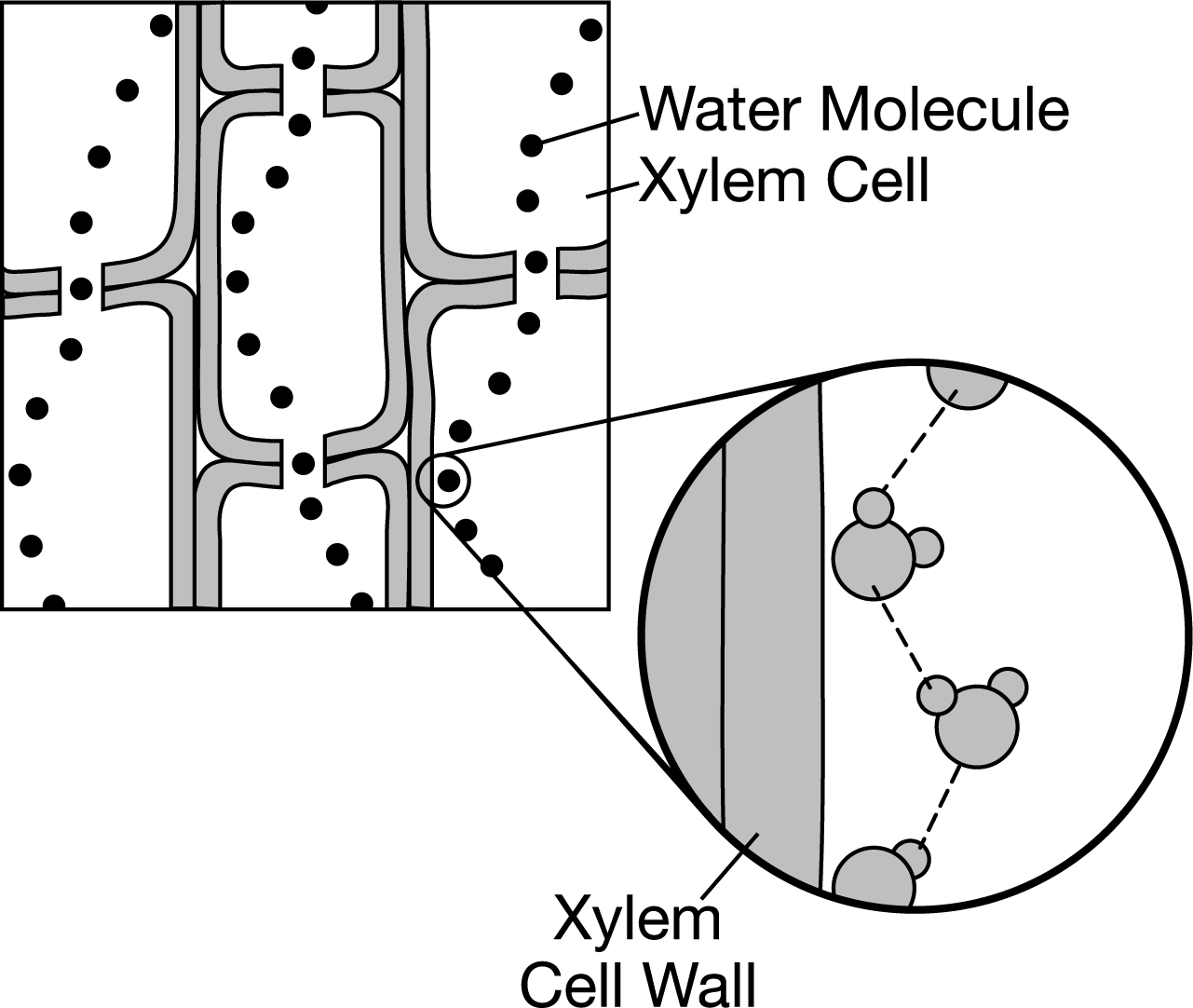
The diagram shows how water can adhere to the xylem in the stems of plants, which contributes to water movement in the plant. Which of the following best explains how water is able to move upward from the roots of a plant, through its xylem in the stem, and out to the leaves?
A: Water is polar, and the walls of the xylem are nonpolar. Water molecules have the ability to form hydrogen bonds with one another but not with the xylem walls.
B: Water is nonpolar, and the walls of the xylem are polar. Water molecules are able to form hydrogen bonds with the xylem walls, and they are pulled up the xylem.
C: Water and the xylem are both nonpolar. Water molecules have the ability to form hydrogen bonds with one another but not with the xylem walls.
D: Water and the xylem are both polar. Water molecules have the ability to form hydrogen bonds with each other and with the walls of the xylem.
D: Water and the xylem are both polar. Water molecules have the ability to form hydrogen bonds with each other and with the walls of the xylem.
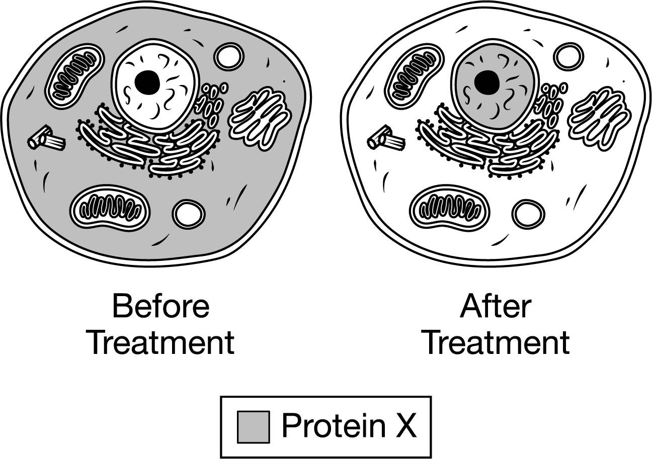
Protein X activates gene expression only in cells exposed to a specific signaling molecule. In a study, researchers determined the intracellular location of Protein X in cultured cells both before and after exposing the cells to the signaling molecule. The results of the study are shown in the diagram.
Based on the results, which of the following best describes what Protein X is?
A: Protein X is an RNA splicing enzyme.
B: Protein X is a cell membrane receptor protein.
C: Protein X is a transcription factor.
D: Protein X is a hormone.
C: Protein X is a transcription factor.
The hormone prolactin has varying effects in many different animal species. All vertebrates produce prolactin, which is involved in signal transduction pathways. In mammals, prolactin stimulates the production of milk in mammary glands. In fish, prolactin plays an important role in osmoregulation. In birds, prolactin is involved in lipid metabolism.
Which of the following best explains the presence of prolactin in various vertebrate species?
A: Though all vertebrates produce prolactin, its varied uses indicate it arose as a result of convergent evolution and not as a result of common ancestry.
B: Prolactin is a homologous hormone because it has a common origin but different functions in various species.
C: Prolactin will bind only to intracellular receptors in animal species with phospholipid bilayers, so its effects are varied in different species.
D: Because of different receptors activating different signal transduction pathways within the same species, it is likely that prolactin production is a trait with highly selective pressure.
B: Prolactin is a homologous hormone because it has a common origin but different functions in various species.
Certain reef-building corals contain photosynthetic, symbiotic algae that have the ability to make dimethylsulphoniopropionate (DMSP), a chemical involved in the marine sulfur cycle. DMSP is released into the surrounding water, where it is converted to the gas dimethyl sulfide (DMS) by microorganisms and enters the atmosphere. Once in the atmosphere, it triggers the formation of sulfate aerosols, which induce cloud formation and block sunlight from heating up the water.
The symbiotic algae produce DMSP when they are stressed by a high water temperature. If water temperature is too high, corals will expel the symbiotic algae that produce DMSP. Researchers measured the amount of DMSP produced by juvenile and adult coral and their symbionts under normal and thermally stressed conditions. The data are shown in the graphs in Figure 1.

Figure 1: DMSP concentration in juvenile and adult corals and their symbionts in normal and thermally-stressed conditions. Error bars represent ±2SE𝑥¯.
The researchers also measured the density of the symbiont as well as the photosynthetic yield in adult corals at the two temperatures. Photosynthetic yield is an index measure of energy output compared to sunlight energy input in which larger photosynthetic yield values represent photosynthetic organisms producing more energy.

Figure 2: Variation in symbiont density and photosynthetic yield in adult corals grown in normal and thermally-stressed conditions. Error bars represent ±2SE𝑥¯.
Which of the following best describes the production of DMSP by coral and coral symbionts?
A: A negative feedback mechanism that increases the environmental change
B: A negative feedback mechanism that reverses the environmental change
C: A positive feedback mechanism that increases the environmental change
D: A positive feedback mechanism that reverses the environmental change
B: A negative feedback mechanism that reverses the environmental change
Certain reef-building corals contain photosynthetic, symbiotic algae that have the ability to make dimethylsulphoniopropionate (DMSP), a chemical involved in the marine sulfur cycle. DMSP is released into the surrounding water, where it is converted to the gas dimethyl sulfide (DMS) by microorganisms and enters the atmosphere. Once in the atmosphere, it triggers the formation of sulfate aerosols, which induce cloud formation and block sunlight from heating up the water.
The symbiotic algae produce DMSP when they are stressed by a high water temperature. If water temperature is too high, corals will expel the symbiotic algae that produce DMSP. Researchers measured the amount of DMSP produced by juvenile and adult coral and their symbionts under normal and thermally stressed conditions. The data are shown in the graphs in Figure 1.
Figure 1: DMSP concentration in juvenile and adult corals and their symbionts in normal and thermally-stressed conditions. Error bars represent ±2SE𝑥¯.
The researchers also measured the density of the symbiont as well as the photosynthetic yield in adult corals at the two temperatures. Photosynthetic yield is an index measure of energy output compared to sunlight energy input in which larger photosynthetic yield values represent photosynthetic organisms producing more energy.
Figure 2: Variation in symbiont density and photosynthetic yield in adult corals grown in normal and thermally-stressed conditions. Error bars represent ±2SE𝑥¯.
Which of the following best describes the effect of temperature on corals’ ability to produce DMSP as shown in Figure 1?
A: Both juvenile and adult corals produce less DMSP at 27°C than at 32°C.
B: Both juvenile and adult corals produce less DMSP at 32°C than at 27°C.
C: The amount of DMSP produced over time increases at 32°C in juveniles only.
D: The amount of DMSP produced over time increases at 32°C in adults only.
A: Both juvenile and adult corals produce less DMSP at 27°C than at 32°C.
Certain reef-building corals contain photosynthetic, symbiotic algae that have the ability to make dimethylsulphoniopropionate (DMSP), a chemical involved in the marine sulfur cycle. DMSP is released into the surrounding water, where it is converted to the gas dimethyl sulfide (DMS) by microorganisms and enters the atmosphere. Once in the atmosphere, it triggers the formation of sulfate aerosols, which induce cloud formation and block sunlight from heating up the water.
The symbiotic algae produce DMSP when they are stressed by a high water temperature. If water temperature is too high, corals will expel the symbiotic algae that produce DMSP. Researchers measured the amount of DMSP produced by juvenile and adult coral and their symbionts under normal and thermally stressed conditions. The data are shown in the graphs in Figure 1.
Figure 1: DMSP concentration in juvenile and adult corals and their symbionts in normal and thermally-stressed conditions. Error bars represent ±2SE𝑥¯.
The researchers also measured the density of the symbiont as well as the photosynthetic yield in adult corals at the two temperatures. Photosynthetic yield is an index measure of energy output compared to sunlight energy input in which larger photosynthetic yield values represent photosynthetic organisms producing more energy.
Figure 2: Variation in symbiont density and photosynthetic yield in adult corals grown in normal and thermally-stressed conditions. Error bars represent ±2SE𝑥¯.
Which of the following best describes the difference between the total amount of DMSP produced by adults compared to juveniles at the start of the 32°C trial?
A: Adult corals produced 3 times more DMSP than juveniles produced.
B: Adult corals produced 3 times less DMSP than juveniles produced.
C: Adult corals produced 5 times more DMSP than juveniles produced.
D: Adult corals produced 5 times less DMSP than juveniles produced.
C: Adult corals produced 5 times more DMSP than juveniles produced.
Certain reef-building corals contain photosynthetic, symbiotic algae that have the ability to make dimethylsulphoniopropionate (DMSP), a chemical involved in the marine sulfur cycle. DMSP is released into the surrounding water, where it is converted to the gas dimethyl sulfide (DMS) by microorganisms and enters the atmosphere. Once in the atmosphere, it triggers the formation of sulfate aerosols, which induce cloud formation and block sunlight from heating up the water.
The symbiotic algae produce DMSP when they are stressed by a high water temperature. If water temperature is too high, corals will expel the symbiotic algae that produce DMSP. Researchers measured the amount of DMSP produced by juvenile and adult coral and their symbionts under normal and thermally stressed conditions. The data are shown in the graphs in Figure 1.
Figure 1: DMSP concentration in juvenile and adult corals and their symbionts in normal and thermally-stressed conditions. Error bars represent ±2SE𝑥¯.
The researchers also measured the density of the symbiont as well as the photosynthetic yield in adult corals at the two temperatures. Photosynthetic yield is an index measure of energy output compared to sunlight energy input in which larger photosynthetic yield values represent photosynthetic organisms producing more energy.
Figure 2: Variation in symbiont density and photosynthetic yield in adult corals grown in normal and thermally-stressed conditions. Error bars represent ±2SE𝑥¯.
In addition to the effect of temperature on DMSP produced by corals and their symbionts, which of the following relationships is also being considered in this experiment?
A: Effect of varying light levels and coral species
B: Effect of additional DMSP produced by symbionts and the corals' age
C: Effect of age and varying light levels
D: Effect of coral species and additional DMSP produced by symbionts
B: Effect of additional DMSP produced by symbionts and the corals' age
Certain reef-building corals contain photosynthetic, symbiotic algae that have the ability to make dimethylsulphoniopropionate (DMSP), a chemical involved in the marine sulfur cycle. DMSP is released into the surrounding water, where it is converted to the gas dimethyl sulfide (DMS) by microorganisms and enters the atmosphere. Once in the atmosphere, it triggers the formation of sulfate aerosols, which induce cloud formation and block sunlight from heating up the water.
The symbiotic algae produce DMSP when they are stressed by a high water temperature. If water temperature is too high, corals will expel the symbiotic algae that produce DMSP. Researchers measured the amount of DMSP produced by juvenile and adult coral and their symbionts under normal and thermally stressed conditions. The data are shown in the graphs in Figure 1.
Figure 1: DMSP concentration in juvenile and adult corals and their symbionts in normal and thermally-stressed conditions. Error bars represent ±2SE𝑥¯.
The researchers also measured the density of the symbiont as well as the photosynthetic yield in adult corals at the two temperatures. Photosynthetic yield is an index measure of energy output compared to sunlight energy input in which larger photosynthetic yield values represent photosynthetic organisms producing more energy.
Figure 2: Variation in symbiont density and photosynthetic yield in adult corals grown in normal and thermally-stressed conditions. Error bars represent ±2SE𝑥¯.
Which of the following best describes the scientists’ findings concerning the density of symbionts presented in Figure 2 ?
A: The symbiont density at 32°C on day 5 was less than the density on day 0 of the experiment.
B: The symbiont density at 27°C on day 0 was less than the density on day 5 of the experiment.
C: The symbiont density at 32°C was different from the density at 27°C on days 5 and 10 of the experiment.
D: The symbiont density at 27°C was higher than the density at 32°C for the entire length of the experiment.
C: The symbiont density at 32°C was different from the density at 27°C on days 5 and 10 of the experiment.
Certain reef-building corals contain photosynthetic, symbiotic algae that have the ability to make dimethylsulphoniopropionate (DMSP), a chemical involved in the marine sulfur cycle. DMSP is released into the surrounding water, where it is converted to the gas dimethyl sulfide (DMS) by microorganisms and enters the atmosphere. Once in the atmosphere, it triggers the formation of sulfate aerosols, which induce cloud formation and block sunlight from heating up the water.
The symbiotic algae produce DMSP when they are stressed by a high water temperature. If water temperature is too high, corals will expel the symbiotic algae that produce DMSP. Researchers measured the amount of DMSP produced by juvenile and adult coral and their symbionts under normal and thermally stressed conditions. The data are shown in the graphs in Figure 1.
Figure 1: DMSP concentration in juvenile and adult corals and their symbionts in normal and thermally-stressed conditions. Error bars represent ±2SE𝑥¯.
The researchers also measured the density of the symbiont as well as the photosynthetic yield in adult corals at the two temperatures. Photosynthetic yield is an index measure of energy output compared to sunlight energy input in which larger photosynthetic yield values represent photosynthetic organisms producing more energy.
Figure 2: Variation in symbiont density and photosynthetic yield in adult corals grown in normal and thermally-stressed conditions. Error bars represent ±2SE𝑥¯.
Which of the following best explains the result of adult corals being exposed to elevated temperatures for extended periods?
A: They are able to obtain more energy from their symbionts because the algae are receiving more light.
B: They are able to obtain more energy from their symbionts because the efficiency increases slightly over time.
C: They are able to obtain less energy from their symbionts because the algae have been expelled.
D: They are able to obtain less energy from their symbionts because more DMSP is being produced at lower temperatures
C: They are able to obtain less energy from their symbionts because the algae have been expelled.
A particular gene has two alleles, a dominant allele 𝐴 and a recessive allele 𝑎. The frequency of allele 𝐴 is 0.55. If the population is in Hardy-Weinberg equilibrium with respect to the gene, then what is the expected frequency of genotype 𝐴𝑎?
A: 0.203
B: 0.303
C: 0.405
D: 0.495
D: 0.495
A particular genetic disorder results from a single change in the amino acid sequence coded for in a gene. Parts of the sequence in normal and mutated genes are shown below.
Normal: | TAC CTC GTG GAC TGA GGT CTC |
Mutated: | TAC CTC GTG GAC TGA GGT CAC |

Based on the codon chart above, which of the following amino acid changes is most likely found in the mutated protein?
Responses
A: Glu → Val
B: Val → Glu
C: Glu → Pro
D: Pro → Val
A: Glu → Val
Figure 1. A pedigree of three generations of a family that have a high frequency of a particular genetic condition
Figure 1 shows the inheritance of a particular genetic condition in three generations of one family. Which of the following best explains the observed pattern of inheritance?
A: The condition is passed randomly because of the independent assortment of chromosomes.
B: The condition is passed from fathers to sons via a Y-linked gene.
C: The condition is passed from mothers to sons via an X-linked gene.
D: The condition is passed from mothers to offspring via a mitochondrial gene.
D: The condition is passed from mothers to offspring via a mitochondrial gene.
Oncogenes are genes that can cause tumor formation as a result of a particular mutation. Which of the following potential therapies would be most effective at preventing the expression of an oncogene?
A: Reducing the number of ribosomes in the cell to prevent the creation of the oncogene’s proteins
B: Blocking membrane-bound receptors of transcription factors
C: Introducing a chemical that binds to transcription factors associated with the oncogene’s promoter
D: Producing additional transcription factors for tumor suppressor genes in the cell
C: Introducing a chemical that binds to transcription factors associated with the oncogene’s promoter
Ultraviolet (UV) radiation can damage DNA by breaking weak bonds. Which of the following best explains how this occurs?
(A) UV radiation disrupts the double helix structure by breaking the covalent bonds between the nitrogenous base pairs.
(B) UV radiation disrupts the double helix structure by breaking the hydrogen bonds between the nitrogenous base pairs.
(C) UV radiation is able to break DNA strands in two by breaking covalent bonds between the sugar-phosphate backbone molecules.
(D) UV radiation is able to break DNA strands in two by breaking hydrogen bonds between the sugar-phosphate backbone molecules.
(B) UV radiation disrupts the double helix structure by breaking the hydrogen bonds between the nitrogenous base pairs.
Scientists are interested in determining the evolution of seven lizard species found on different islands of the Canary Island group. They isolated DNA from individuals of each species and sequenced the mitochondrial gene that encodes cytochrome 𝑏. The numbers of genetic differences between species are shown in the table below.

Based on the data in the table, which of the following lizard species are most closely related?
A: Species C and species B
B: Species E and species D
C: Species F and species B
D: Species G and species A
B: Species E and species D
Figure 1. A model of an endocrine signaling pathway showing involved body parts and hormones. GnRH = gonadotropin-releasing hormone, LH = luteinizing hormone, and FSH = follicle-stimulating hormone.
Figure 1 shows a model of the endocrine signaling pathway that regulates ovulation. Which of the following observations would provide evidence of a positive feedback mechanism in this system?
A: Estrogen from the ovaries inhibits the release of GnRH from the hypothalamus.
B: Progesterone from the ovaries stimulates the thickening of the uterine lining.
C: Progesterone from the ovaries inhibits the release of LH and FSH from the anterior pituitary.
D: Estrogen from the ovaries stimulates the hypothalamus and anterior pituitary to secrete more GnRH, LH, and FSH.
D: Estrogen from the ovaries stimulates the hypothalamus and anterior pituitary to secrete more GnRH, LH, and FSH.
Dichlorophenolindophenol (DCPIP) is a chemical dye. When DCPIP is chemically reduced, it changes color from blue to clear. DCPIP can be used as an electron acceptor in experiments that measure the rate of electron transport through the electron transport chain. A student performed an experiment to study the effects of a chemical, DCMU, on photosynthesis.
The student prepared four tubes with a liquid buffer and chloroplasts that had been extracted from spinach leaves. The student then added DCPIP to three of the tubes and added DCMU to one of them. Additionally, tube 3 was wrapped in tin foil. The contents of each tube are shown in the table. The student then incubated each tube for 60 minutes and measured the absorbance (A600) of each solution at five-minute intervals. The absorbance readings of each solution are shown in Figure 1.
Tube 1: | Buffer and water |
Tube 2: | DCPIP, buffer, and water |
Tube 3: | DCPIP, buffer, and water (wrapped in foil) |
Tube 4: | DCPIP, buffer, and 1.0mMDCMU |

Figure 1. Absorbance readings of four prepared tubes with various solutions over a 60-minute period.
In which of the following tubes did the greatest reduction of DCPIP occur after 60 minutes?
A: Tube 1
B: Tube 2
C: Tube 3
D: Tube 4
B: Tube 2
Dichlorophenolindophenol (DCPIP) is a chemical dye. When DCPIP is chemically reduced, it changes color from blue to clear. DCPIP can be used as an electron acceptor in experiments that measure the rate of electron transport through the electron transport chain. A student performed an experiment to study the effects of a chemical, DCMU, on photosynthesis.
The student prepared four tubes with a liquid buffer and chloroplasts that had been extracted from spinach leaves. The student then added DCPIP to three of the tubes and added DCMU to one of them. Additionally, tube 3 was wrapped in tin foil. The contents of each tube are shown in the table. The student then incubated each tube for 60 minutes and measured the absorbance (A600) of each solution at five-minute intervals. The absorbance readings of each solution are shown in Figure 1.
Tube 1: | Buffer and water |
Tube 2: | DCPIP, buffer, and water |
Tube 3: | DCPIP, buffer, and water (wrapped in foil) |
Tube 4: | DCPIP, buffer, and 1.0mMDCMU |
Figure 1. Absorbance readings of four prepared tubes with various solutions over a 60-minute period.
Which of the following claims is best supported by the experimental results?
A: Light is required for the electron transport chain to transfer electrons.
B: Water, not carbon dioxide, is the source of electrons used in the light-dependent reaction of photosynthesis.
C: Carbon dioxide is the source of carbon used by green plants to build carbohydrates.
D: DCPIP provides a significant source of electrons to the electron transport chain of the light reaction in the absence of light.
A: Light is required for the electron transport chain to transfer electrons.
Dichlorophenolindophenol (DCPIP) is a chemical dye. When DCPIP is chemically reduced, it changes color from blue to clear. DCPIP can be used as an electron acceptor in experiments that measure the rate of electron transport through the electron transport chain. A student performed an experiment to study the effects of a chemical, DCMU, on photosynthesis.
The student prepared four tubes with a liquid buffer and chloroplasts that had been extracted from spinach leaves. The student then added DCPIP to three of the tubes and added DCMU to one of them. Additionally, tube 3 was wrapped in tin foil. The contents of each tube are shown in the table. The student then incubated each tube for 60 minutes and measured the absorbance (A600) of each solution at five-minute intervals. The absorbance readings of each solution are shown in Figure 1.
Tube 1: | Buffer and water |
Tube 2: | DCPIP, buffer, and water |
Tube 3: | DCPIP, buffer, and water (wrapped in foil) |
Tube 4: | DCPIP, buffer, and 1.0mMDCMU |
Figure 1. Absorbance readings of four prepared tubes with various solutions over a 60-minute period.
Which of the following best explains how DCMU affected the reaction?
A: DCMU acts as a second buffer in the reaction.
B: DCMU acts as an additional carrier of electrons from photosystem II to DCPIP.
C: DCMU acts as an additional source of electrons to the light reaction of photosynthesis.
D: DCMU acts as an inhibitor to the movement of electrons within the light reaction of photosynthesis.
D: DCMU acts as an inhibitor to the movement of electrons within the light reaction of photosynthesis.
Dichlorophenolindophenol (DCPIP) is a chemical dye. When DCPIP is chemically reduced, it changes color from blue to clear. DCPIP can be used as an electron acceptor in experiments that measure the rate of electron transport through the electron transport chain. A student performed an experiment to study the effects of a chemical, DCMU, on photosynthesis.
The student prepared four tubes with a liquid buffer and chloroplasts that had been extracted from spinach leaves. The student then added DCPIP to three of the tubes and added DCMU to one of them. Additionally, tube 3 was wrapped in tin foil. The contents of each tube are shown in the table. The student then incubated each tube for 60 minutes and measured the absorbance (A600) of each solution at five-minute intervals. The absorbance readings of each solution are shown in Figure 1.
Tube 1: | Buffer and water |
Tube 2: | DCPIP, buffer, and water |
Tube 3: | DCPIP, buffer, and water (wrapped in foil) |
Tube 4: | DCPIP, buffer, and 1.0mMDCMU |
Figure 1. Absorbance readings of four prepared tubes with various solutions over a 60-minute period.
Which of the following best justifies the use of tube 2 as a control treatment?
A: It was a negative control for the accuracy of the spectrophotometer, ensuring that an accurate reading for treatment cuvette 2 would be made.
B: It was a negative control for the chemical stability of the chlorophyll suspension, ensuring that changes in absorbance could only be attributed to changes in chlorophyll content.
C: It was a positive control for the change in DCPIP color associated with changes in light intensity.
D: It was a positive control for measuring the effect of DCMU on the reaction.
D: It was a positive control for measuring the effect of DCMU on the reaction.
A scientist designed an experiment to test an artificial membrane that mimics the phospholipid bilayer of a cell.
The scientist built a tube that was divided by an artificial membrane and filled with distilled water. The scientist put a known amount of a protein into the water on one side of the membrane. After some time, the scientist measured the concentration of the protein on either side of the membrane but found that there had been no change.
Which of the following experimental changes would allow the scientist to observe transport of a solute across the artificial membrane?
A: Increase the solute concentration in the solution
B: Use a small, nonpolar solute instead of a protein
C: Increase the temperature of the solution
D: Add artificial aquaporins to the membrane
B: Use a small, nonpolar solute instead of a protein
Which of the following best illustrates the flow of information required for the synthesis of proteins encoded in the genome of a retrovirus?
A: DNA → RNA → PROTEIN
B: RNA → DNA → PROTEIN
C: RNA → DNA → RNA → PROTEIN
D: DNA → RNA → DNA → PROTEIN
C: RNA → DNA → RNA → PROTEIN
Which of the following best describes the process by which gas from the atmosphere is obtained by plants and used to build lipids?
A: Gas is fixed by plants as part of the sulfur cycle.
B: Gas is fixed by plants as part of the nitrogen cycle.
C: Gas is directly obtained by plants as part of the carbon cycle.
D: Gas is directly obtained by plants as part of the magnesium cycle.
C: Gas is directly obtained by plants as part of the carbon cycle.
Which of the following best explains how the phospholipid bilayer of a transport vesicle contributes to cellular functions?
A: The phospholipid bilayer allows the vesicle to fuse with the Golgi apparatus and the plasma membrane, allowing the exocytosis of proteins.
B: The phospholipid bilayer physically connects the nuclear envelope to the rough endoplasmic reticulum, thus increasing the rate of transcription and translation.
C: The phospholipid bilayer of a transport vesicle contains chemicals that digest the proteins made in the rough endoplasmic reticulum.
D: The phospholipid bilayer contains enzymes that catalyze the conversion of hydrogen peroxide to water and oxygen.
A: The phospholipid bilayer allows the vesicle to fuse with the Golgi apparatus and the plasma membrane, allowing the exocytosis of proteins.
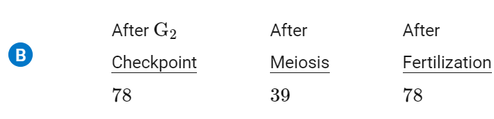
The diploid number of chromosomes in the cell of a domesticated dog is 78. Which of the following options includes the correct number of chromosomes in a cell after each cellular process (G2 checkpoint, meiosis, and fertilization, respectively)?
(ignore the that i accidentally selected A)
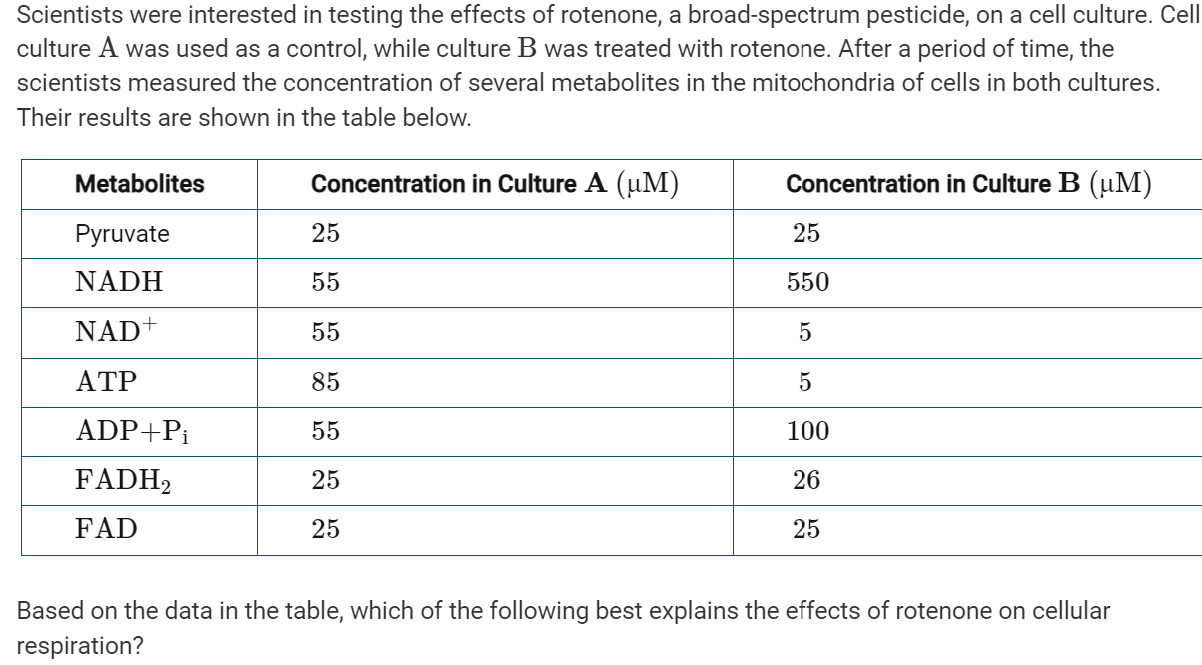
A: Rotenone acts as an inhibitor of the enzymes in the Krebs cycle.
B: NADH, produced during glycolysis, is not able to enter the mitochondria because transport proteins are blocked from entering.
C: Treated cells are not able to break down NADH because certain enzymes of the electron transport chain are inhibited.
D: Rotenone acts as an allosteric inhibitor of glycolytic enzymes, thus inhibiting cellular respiration.
C: Treated cells are not able to break down NADH because certain enzymes of the electron transport chain are inhibited.
Which of the following best explains why triploid bananas do not produce seeds?
A: The cells of the banana plant are unable to replicate DNA, thus preventing cell division and limiting growth.
B: The banana plants lack enough genetic diversity to properly hybridize.
C: The production of gametes is disrupted because of unequal pairing of homologous chromosomes during meiosis.
D: The production of seeds is not required because triploid plants produce gametes without fertilization.
C: The production of gametes is disrupted because of unequal pairing of homologous chromosomes during meiosis.
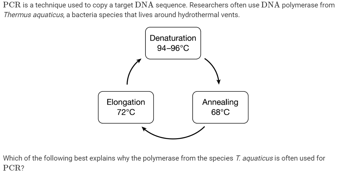
A: T. aquaticus polymerase has an optimal temperature of 68°C.
B: T. aquaticus polymerase does not denature at high temperatures.
C: T. aquaticus polymerase can be used more than once without degrading.
D: T. aquaticus polymerase adds nucleotides to both the 3′ and 5′ ends of DNA.
B: T. aquaticus polymerase does not denature at high temperatures.
(accidentally clicked on an answer again)
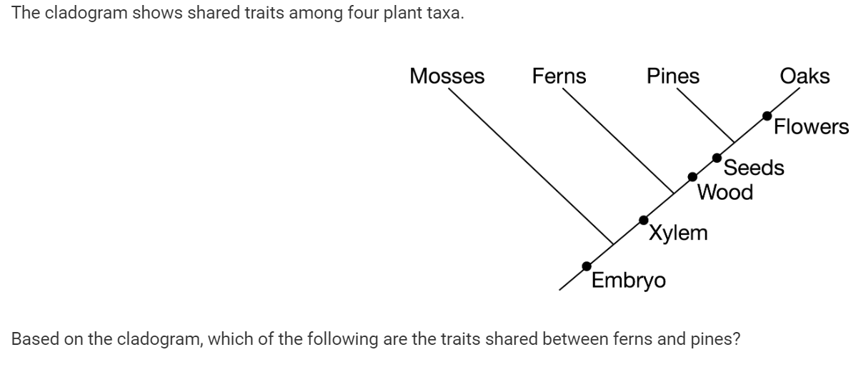
A: Xylem only
B: Seeds and wood only
C: Embryo and xylem only
D: Embryo, xylem, wood, and seeds only
C: Embryo and xylem only
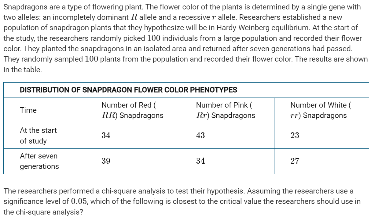
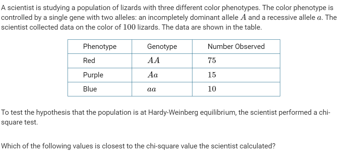
A: 3.84
B: 5.99
C: 7.82
D: 9.49
A: 3.84
Sea otters are native to the western coast of North America. Between 1750 and 1850, hunting had reduced the population from hundreds of thousands to only one thousand individuals. In the early 1900s, a small population of sea otters was discovered in Elkhorn Slough, an estuary in central California near a large human population center. The otters were then protected by the international fur seal treaty, which banned sea otter hunting. The sea otter population has rebounded to nearly three thousand individuals today.
Otters live in kelp forests and eelgrass beds and feed on crabs and shellfish (Figure 1). Most herbivores in the habitat eat algae that grows on the eelgrass and not the eelgrass itself. If there is too much algae, the eelgrass does not receive enough light for photosynthesis. As the otter population has increased, the eelgrass habitat has increased.

Figure 1. Partial food chain in eelgrass habitats
Recently, however, scientists have noticed the presence of two nonnative, predatory invertebrate species that may be colonizing the Elkhorn Slough, which would have been too cold for them three decades ago. Scientists have also observed that otters in the area are experiencing increased mortality because of an increase in harmful algal blooms, which occur as a result of nutrient pollution. The harmful algae are ingested by shellfish, which the otters eat.
Which of the following best describes what happened to the otter population between 1750 and 1850 ?
A: The population decreased in size as a result of a loss of genetic diversity.
B: The population decreased in size as a result of habitat loss.
C: The population lost genetic diversity as a result of a bottleneck effect.
D: The population lost genetic diversity as a result of the founder effect.
C: The population lost genetic diversity as a result of a bottleneck effect.
Sea otters are native to the western coast of North America. Between 1750 and 1850, hunting had reduced the population from hundreds of thousands to only one thousand individuals. In the early 1900s, a small population of sea otters was discovered in Elkhorn Slough, an estuary in central California near a large human population center. The otters were then protected by the international fur seal treaty, which banned sea otter hunting. The sea otter population has rebounded to nearly three thousand individuals today.
Otters live in kelp forests and eelgrass beds and feed on crabs and shellfish (Figure 1). Most herbivores in the habitat eat algae that grows on the eelgrass and not the eelgrass itself. If there is too much algae, the eelgrass does not receive enough light for photosynthesis. As the otter population has increased, the eelgrass habitat has increased.
Figure 1. Partial food chain in eelgrass habitats
Recently, however, scientists have noticed the presence of two nonnative, predatory invertebrate species that may be colonizing the Elkhorn Slough, which would have been too cold for them three decades ago. Scientists have also observed that otters in the area are experiencing increased mortality because of an increase in harmful algal blooms, which occur as a result of nutrient pollution. The harmful algae are ingested by shellfish, which the otters eat.
Based on the information provided in the passage, which of the following best describes the effect of harmful algal blooms on otter populations
A: They are a density-dependent factor that increases otter mortality in larger populations.
B: hey are a density-dependent factor that reduces otter numbers at lower population sizes
C: They are a density-independent factor that negatively affects the otter population regardless of its size.
D: They are a density-independent factor that increases otter mortality in only larger populations.
C: They are a density-independent factor that negatively affects the otter population regardless of its size.
Sea otters are native to the western coast of North America. Between 1750 and 1850, hunting had reduced the population from hundreds of thousands to only one thousand individuals. In the early 1900s, a small population of sea otters was discovered in Elkhorn Slough, an estuary in central California near a large human population center. The otters were then protected by the international fur seal treaty, which banned sea otter hunting. The sea otter population has rebounded to nearly three thousand individuals today.
Otters live in kelp forests and eelgrass beds and feed on crabs and shellfish (Figure 1). Most herbivores in the habitat eat algae that grows on the eelgrass and not the eelgrass itself. If there is too much algae, the eelgrass does not receive enough light for photosynthesis. As the otter population has increased, the eelgrass habitat has increased.
Figure 1. Partial food chain in eelgrass habitats
Recently, however, scientists have noticed the presence of two nonnative, predatory invertebrate species that may be colonizing the Elkhorn Slough, which would have been too cold for them three decades ago. Scientists have also observed that otters in the area are experiencing increased mortality because of an increase in harmful algal blooms, which occur as a result of nutrient pollution. The harmful algae are ingested by shellfish, which the otters eat.
As otters were removed during the hunting years, there was a large decrease in the catches of fish species from the eelgrass habitats. Which of the following best explains why this decrease happened?
A: Otters are a keystone species, so their disappearance from the area affected the population size of one other species.
B: Otters are a keystone species, so their disappearance from the area resulted in the collapse of an entire community.
C: Otters have mutualistic relationships with many other species, so their disappearance from the area affected the population size of another species.
D: Otters have mutualistic relationships with many other species, so their disappearance from the area resulted in the collapse of an entire ecosystem.
B: Otters are a keystone species, so their disappearance from the area resulted in the collapse of an entire community.
Sea otters are native to the western coast of North America. Between 1750 and 1850, hunting had reduced the population from hundreds of thousands to only one thousand individuals. In the early 1900s, a small population of sea otters was discovered in Elkhorn Slough, an estuary in central California near a large human population center. The otters were then protected by the international fur seal treaty, which banned sea otter hunting. The sea otter population has rebounded to nearly three thousand individuals today.
Otters live in kelp forests and eelgrass beds and feed on crabs and shellfish (Figure 1). Most herbivores in the habitat eat algae that grows on the eelgrass and not the eelgrass itself. If there is too much algae, the eelgrass does not receive enough light for photosynthesis. As the otter population has increased, the eelgrass habitat has increased.
Figure 1. Partial food chain in eelgrass habitats
Recently, however, scientists have noticed the presence of two nonnative, predatory invertebrate species that may be colonizing the Elkhorn Slough, which would have been too cold for them three decades ago. Scientists have also observed that otters in the area are experiencing increased mortality because of an increase in harmful algal blooms, which occur as a result of nutrient pollution. The harmful algae are ingested by shellfish, which the otters eat.
Climate change could affect the ecosystem of the Elkhorn Slough in many ways. From the information provided, which of the following predictions about the direct, local effects of climate change is most likely?
A: Ocean warming will favor population growth of nonnative species as their habitats shift northward.
B: Ocean warming will decrease eelgrass habitat area as a result of increased herbivory by nonnative species.
C: Harmful algal blooms will decrease otter populations as a result of increased mortality of otter prey species.
D: Harmful algal blooms will decrease the availability of nutrients for eelgrass and other algae species.
A: Ocean warming will favor population growth of nonnative species as their habitats shift northward.
Sea otters are native to the western coast of North America. Between 1750 and 1850, hunting had reduced the population from hundreds of thousands to only one thousand individuals. In the early 1900s, a small population of sea otters was discovered in Elkhorn Slough, an estuary in central California near a large human population center. The otters were then protected by the international fur seal treaty, which banned sea otter hunting. The sea otter population has rebounded to nearly three thousand individuals today.
Otters live in kelp forests and eelgrass beds and feed on crabs and shellfish (Figure 1). Most herbivores in the habitat eat algae that grows on the eelgrass and not the eelgrass itself. If there is too much algae, the eelgrass does not receive enough light for photosynthesis. As the otter population has increased, the eelgrass habitat has increased.
Figure 1. Partial food chain in eelgrass habitats
Recently, however, scientists have noticed the presence of two nonnative, predatory invertebrate species that may be colonizing the Elkhorn Slough, which would have been too cold for them three decades ago. Scientists have also observed that otters in the area are experiencing increased mortality because of an increase in harmful algal blooms, which occur as a result of nutrient pollution. The harmful algae are ingested by shellfish, which the otters eat.
Based on the information, an increase in the sea slug population would most likely be directly related to which of the following?
A: An increase in the eelgrass population
B: The introduction of nonnative invertebrates
C: A decrease in algae availability
D: A decrease in the crab population
D: A decrease in the crab population
Many fish species, such as fathead minnows, release a pheromone when their skin cells are damaged. Researchers placed pike, a predator of fathead minnows, in a choice chamber and released the minnow pheromone at one end of the chamber. The researchers observed that the pike oriented themselves toward the end of the chamber where the pheromone was released.
Which of the following questions will best guide a follow-up investigation about the role of pheromones in locating prey?
A: How do pike determine that the fathead minnow pheromone is present in the water?
B: Why do pike prey on fathead minnows?
C: Do pike have natural predators in the environment?
D: Do pike release pheromones that are detected by fathead minnows?
A: How do pike determine that the fathead minnow pheromone is present in the water?
Which of the following best explains why a cell’s plasma membrane is composed of two layers of phospholipids rather than just a single layer?
A: Having two oppositely oriented layers of phospholipids allows only the hydrophilic heads to interact with water inside and outside of the cell.
B: Having two oppositely oriented layers of phospholipids allows the hydrophilic heads to repel water both inside and outside of the cells.
C: Having two identically oriented layers of phospholipids gives cells more protection from the exterior environment than just a single layer would.
D: Having two identically oriented layers of phospholipids allows for the production of vacuoles while still maintaining a protective barrier.
A: Having two oppositely oriented layers of phospholipids allows only the hydrophilic heads to interact with water inside and outside of the cell.
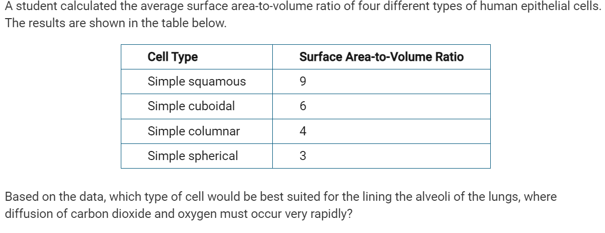
A: Simple squamous cells
B: Simple cuboidal cells
C: Simple columnar cells
D: Simple spherical cells
A: Simple squamous cells
Which of the following best explains how the extensive folding of the inner mitochondrial membrane benefits a eukaryotic cell?
A: It enlarges the volume of the matrix, which allows for more enzymatic reactions.
B: It increases the area available for proteins involved in energy transfer.
C: It allows for greater area for the diffusion of water into and out of the mitochondria.
D: It provides better insulation for reactions in the matrix from conditions outside the mitochondria.
B: It increases the area available for proteins involved in energy transfer.
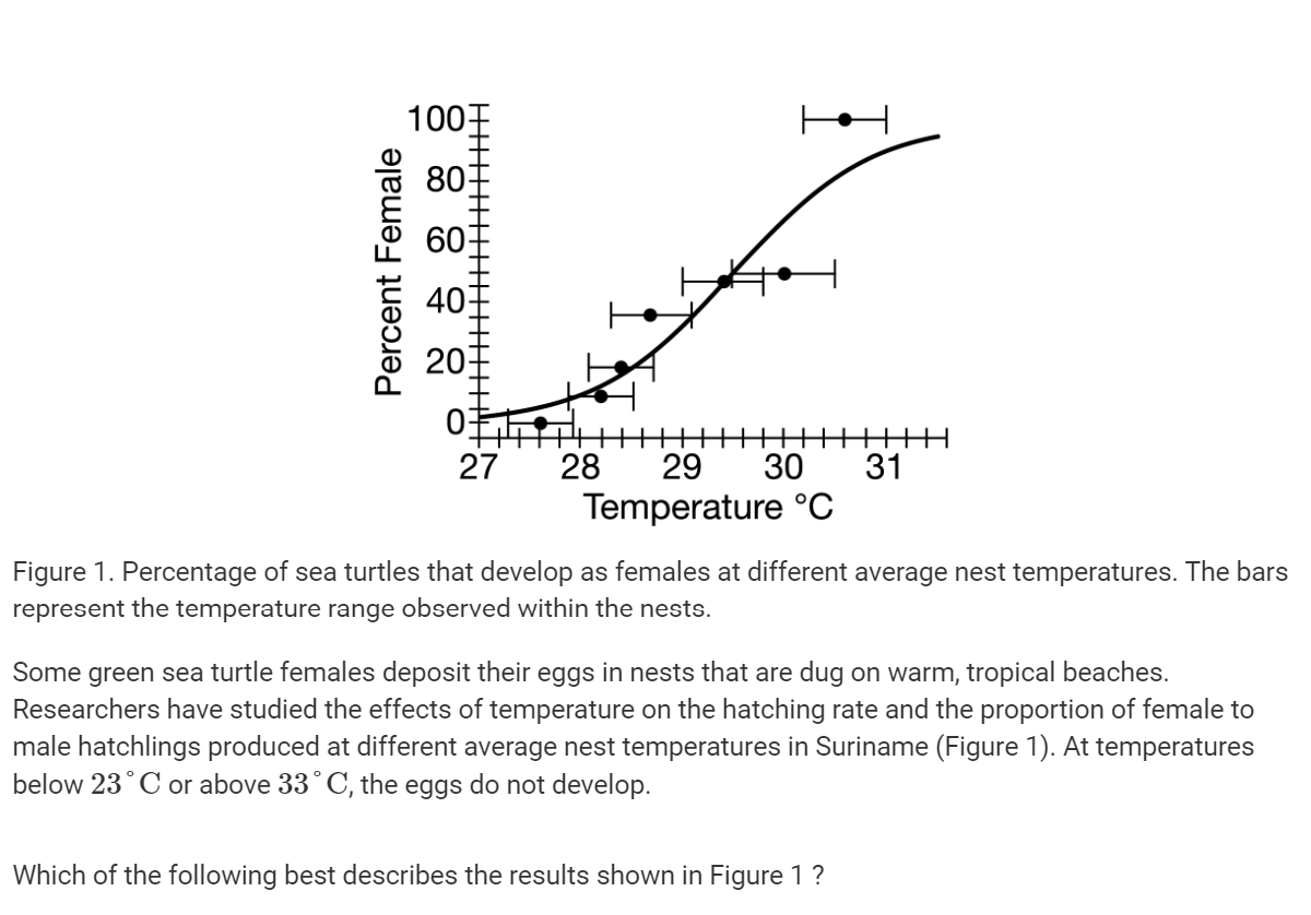
A: The percentage of hatchlings that survive to adulthood is directly proportional to average nest temperature.
B: Female sea turtles search for cooler beaches in order to have more male offspring.
C: Warmer nests produce more female sea turtles than do cooler nests.
D: The sex ratio of sea turtles is genetically determined.
C: Warmer nests produce more female sea turtles than do cooler nests.
A: A fish that has mouth parts adapted to eat moderately sized prey is introduced into a lake in which there are only large and small prey.
B: A population of mice live on the ground and in short trees. An invasive, tree-dwelling snake that preys on the mice is introduced into the area.
C: Climate change-induced warming of arctic tundra reduces average snow cover that lighter-colored arctic foxes rely on for camouflage. Darker-colored arctic foxes are better suited to the exposed moss and grass habitat.
D: House sparrows that lay smaller-than-average clutches of eggs produce fewer viable offspring, while larger-than-average clutches of eggs result in malnourished chicks that have a higher mortality rate.
D: House sparrows that lay smaller-than-average clutches of eggs produce fewer viable offspring, while larger-than-average clutches of eggs result in malnourished chicks that have a higher mortality rate.
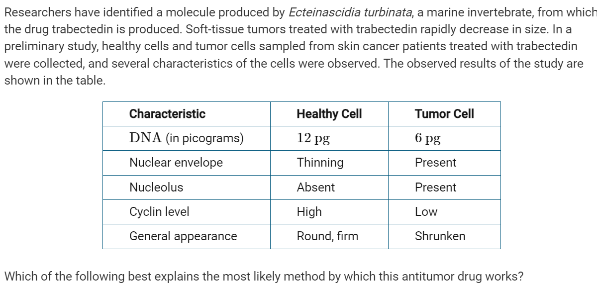
A: Trabectedin increases the production of cyclin proteins that signal the cancer cells to enter prophase.
B: Trabectedin interferes with the plasma membrane, causing it to break down and expose the DNA to damage.
C: Trabectedin interferes with the duplication of DNA during interphase and thus prevents cancer cells from passing the G2 checkpoint.
D: Trabectedin interferes with the regulations of cyclin proteins, causing their levels to increase and creating errors in DNA.
C: Trabectedin interferes with the duplication of DNA during interphase and thus prevents cancer cells from passing the G2 checkpoint.
Friedreich’s ataxia is an inherited disorder. Friedreich’s ataxia is caused by an insertion mutation in a noncoding portion of the 𝐹𝑋𝑁 gene where a GAA triplet is repeated hundreds of times. The 𝐹𝑋𝑁 gene encodes the protein frataxin. A pedigree of a family with members affected by this disorder is shown in Figure 1.

Figure 1. A pedigree of a family affected by Friedreich’s ataxia
A researcher collected DNA from several members of the family and used PCR to amplify the FXN genes from each individual’s DNA. The researcher then used DNA gel electrophoresis to separate the DNA. The results are shown in Figure 2.

Figure 2. 𝐹𝑋𝑁 gene fragment sizes for several family members. A sample of DNA with fragments of known lengths was used for comparison.
The researcher also used a computer to model the structure of the mutant 𝐹𝑋𝑁 allele. The model suggests that the repeated GAA triplets in the mutant 𝐹𝑋𝑁 gene may lead to the formation of an unusual triple-stranded configuration of DNA (Figure 3).

Figure 3. The modeled DNA triple-helix structure that can form in areas with multiple GAA triplets
Based on the data in Figure 1, which of the following best describes the inheritance pattern of Friedreich’s ataxia?
A: Autosomal recessive
B: Autosomal dominant
C: Sex-linked recessive
D: Sex-linked dominant
A: Autosomal recessive
Friedreich’s ataxia is an inherited disorder. Friedreich’s ataxia is caused by an insertion mutation in a noncoding portion of the 𝐹𝑋𝑁 gene where a GAA triplet is repeated hundreds of times. The 𝐹𝑋𝑁 gene encodes the protein frataxin. A pedigree of a family with members affected by this disorder is shown in Figure 1.
Figure 1. A pedigree of a family affected by Friedreich’s ataxia
A researcher collected DNA from several members of the family and used PCR to amplify the FXN genes from each individual’s DNA. The researcher then used DNA gel electrophoresis to separate the DNA. The results are shown in Figure 2.
Figure 2. 𝐹𝑋𝑁 gene fragment sizes for several family members. A sample of DNA with fragments of known lengths was used for comparison.
The researcher also used a computer to model the structure of the mutant 𝐹𝑋𝑁 allele. The model suggests that the repeated GAA triplets in the mutant 𝐹𝑋𝑁 gene may lead to the formation of an unusual triple-stranded configuration of DNA (Figure 3).
Figure 3. The modeled DNA triple-helix structure that can form in areas with multiple GAA triplets
The probability that individual III-5 will develop Friedreich’s ataxia is closest to which of the following?
A: 0%
B: 25%
C: 50%
D: 75%
B: 25%
Friedreich’s ataxia is an inherited disorder. Friedreich’s ataxia is caused by an insertion mutation in a noncoding portion of the 𝐹𝑋𝑁 gene where a GAA triplet is repeated hundreds of times. The 𝐹𝑋𝑁 gene encodes the protein frataxin. A pedigree of a family with members affected by this disorder is shown in Figure 1.
Figure 1. A pedigree of a family affected by Friedreich’s ataxia
A researcher collected DNA from several members of the family and used PCR to amplify the FXN genes from each individual’s DNA. The researcher then used DNA gel electrophoresis to separate the DNA. The results are shown in Figure 2.
Figure 2. 𝐹𝑋𝑁 gene fragment sizes for several family members. A sample of DNA with fragments of known lengths was used for comparison.
The researcher also used a computer to model the structure of the mutant 𝐹𝑋𝑁 allele. The model suggests that the repeated GAA triplets in the mutant 𝐹𝑋𝑁 gene may lead to the formation of an unusual triple-stranded configuration of DNA (Figure 3).
Figure 3. The modeled DNA triple-helix structure that can form in areas with multiple GAA triplets
Which of the following statements best describes the results seen in Figure 2
A: Individuals III-2 and III-3 carry two different alleles of the 𝐹𝑋𝑁 gene, a mutant allele and a wild-type allele. Individual IV-1 inherited two copies of the mutant allele.
B: Individuals III-2 and III-3 carry two different alleles of the 𝐹𝑋𝑁 gene, a mutant allele and a wild-type allele. Individual IV-1 inherited two copies of the wild-type allele.
C: Individuals III-2 and III-3 both carry two wild-type alleles. Individual IV-1 inherited two copies of the wild-type allele.
D: Individuals III-2 and III-3 both carry two wild-type alleles, but individual IV-1 inherited one copy of the wild-type allele and one copy of the mutant allele.
A: Individuals III-2 and III-3 carry two different alleles of the 𝐹𝑋𝑁 gene, a mutant allele and a wild-type allele. Individual IV-1 inherited two copies of the mutant allele.
Friedreich’s ataxia is an inherited disorder. Friedreich’s ataxia is caused by an insertion mutation in a noncoding portion of the 𝐹𝑋𝑁 gene where a GAA triplet is repeated hundreds of times. The 𝐹𝑋𝑁 gene encodes the protein frataxin. A pedigree of a family with members affected by this disorder is shown in Figure 1.
Figure 1. A pedigree of a family affected by Friedreich’s ataxia
A researcher collected DNA from several members of the family and used PCR to amplify the FXN genes from each individual’s DNA. The researcher then used DNA gel electrophoresis to separate the DNA. The results are shown in Figure 2.
Figure 2. 𝐹𝑋𝑁 gene fragment sizes for several family members. A sample of DNA with fragments of known lengths was used for comparison.
The researcher also used a computer to model the structure of the mutant 𝐹𝑋𝑁 allele. The model suggests that the repeated GAA triplets in the mutant 𝐹𝑋𝑁 gene may lead to the formation of an unusual triple-stranded configuration of DNA (Figure 3).
Figure 3. The modeled DNA triple-helix structure that can form in areas with multiple GAA triplets
Which of the following best describes the most likely effect of the formation of a triplex DNA structure (Figure 3) on the synthesis of the frataxin protein?
A: The binding of the ribosome to the mRNA is prevented, resulting in a decrease in frataxin translation.
B: The DNA will not degrade in the cytoplasm, leading to an increase in frataxin translation.
C: RNA polymerase is prevented from binding to the DNA, resulting in a decrease in frataxin mRNA transcription.
D: The protein will include extra amino acids, resulting in a protein with an altered secondary structure.
C: RNA polymerase is prevented from binding to the DNA, resulting in a decrease in frataxin mRNA transcription.
Friedreich’s ataxia is an inherited disorder. Friedreich’s ataxia is caused by an insertion mutation in a noncoding portion of the 𝐹𝑋𝑁 gene where a GAA triplet is repeated hundreds of times. The 𝐹𝑋𝑁 gene encodes the protein frataxin. A pedigree of a family with members affected by this disorder is shown in Figure 1.
Figure 1. A pedigree of a family affected by Friedreich’s ataxia
A researcher collected DNA from several members of the family and used PCR to amplify the FXN genes from each individual’s DNA. The researcher then used DNA gel electrophoresis to separate the DNA. The results are shown in Figure 2.
Figure 2. 𝐹𝑋𝑁 gene fragment sizes for several family members. A sample of DNA with fragments of known lengths was used for comparison.
The researcher also used a computer to model the structure of the mutant 𝐹𝑋𝑁 allele. The model suggests that the repeated GAA triplets in the mutant 𝐹𝑋𝑁 gene may lead to the formation of an unusual triple-stranded configuration of DNA (Figure 3).
Figure 3. The modeled DNA triple-helix structure that can form in areas with multiple GAA triplets
Which of the following types of bonds is most likely responsible for the unusual base pairing shown in Figure 3 that results in the formation of a triplex DNA structure?
A: Hydrogen
B: Polar covalent
C: Ionic
D: Nonpolar covalent
A: Hydrogen
A: 0.1
B: 1.9
C: 18.3
D: 23.1
D: 23.1
Scientists compared the chemical structure of several molecules that various bacterial species use for quorum sensing. Quorum sensing is an ability some bacteria have to detect the number of related cells nearby. The chemical structure of some of these molecules found in certain species of bacteria are shown in Figure 1.

Figure 1. The chemical structure of several molecules used for quorum sensing in three species of bacteria
Which of the following research questions would best guide an investigation of the link between the structure of the signaling molecules and the evolution of quorum sensing?
A: Do these molecules require the same receptors in each bacteria species to generate a response?
B: Did these species evolve from a common ancestor that used a similar signaling molecule?
C: Do these species all perform the same action when the concentration of the signaling molecules is high enough?
D: Did these species evolve from the same common ancestor that is still living today and uses the same receptors?
B: Did these species evolve from a common ancestor that used a similar signaling molecule?
Carbon dioxide most likely enters a cell through which of the following processes?
A: Simple diffusion through the membrane
B: Facilitated diffusion through membrane proteins
C: Active transport through membrane proteins
D: Active transport through aquaporins
A: Simple diffusion through the membrane
In pea seeds, yellow color (𝑌) is dominant to green color (𝑦), and a round shape (𝑅) is dominant to a wrinkled shape (𝑟). A dihybrid cross between a true-breeding plant with yellow, round seeds (𝑌𝑌𝑅𝑅) and a true-breeding plant with green, wrinkled seeds (𝑦𝑦𝑟𝑟) results in an F1 generation of plants with yellow, round seeds. Crossing two F1 plants produces an F2 generation with approximately nine times as many plants with yellow, round seeds as plants with green, wrinkled seeds.
Which of the following best explains these results?
A: The allele pairs of each parent stay together, resulting in gametes that are identical to the parents.
B: Gene segments on sister chromatids cross over.
C: Alleles that are on nonhomologous chromosomes recombine.
D: The genes for seed color and seed shape assort independently.
D: The genes for seed color and seed shape assort independently.