


DCMP 4D Assignment
Read these two quotes about the U.S. 2017 Tax Reform bill:
“We're doing everything we can to reduce the tax burden on you and your family. By eliminating tax breaks and loopholes, we will ensure that the benefits are focused on the middle class, the working men and women, not the highest income earners. Our framework includes our explicit commitment that tax reform will protect low-income and middle-income households, not the wealthy and well connected.” – President Donald Trump in 2017, prior to the bill’s enactment.
“You remember just a few years ago when Trump and my Republican colleagues voted for almost $2 trillion in tax breaks for the wealthiest people in this country and the largest corporations.” – Bernie Sanders in 2021, after the bill was enacted.
1) Describe the differences in how these two politicians characterized the effects of the 2017 Tax Reform. How would you investigate whether these claims were accurate or misleading?
Donald Trump’s claim was more about helping lower income and middle class for tax breaks, whereas Bernie Sanders was contradicting that and saying how misleading it is.
According to the independent Tax Policy Center, the average income tax cut as a result of the law was $1,260.4 However, as we’ve seen before, averages can be misleading and uninformative. Two boxplots are provided below, each displaying a hypothetical distribution of 5,000 tax cuts that would result in a mean tax cut of $1,260.
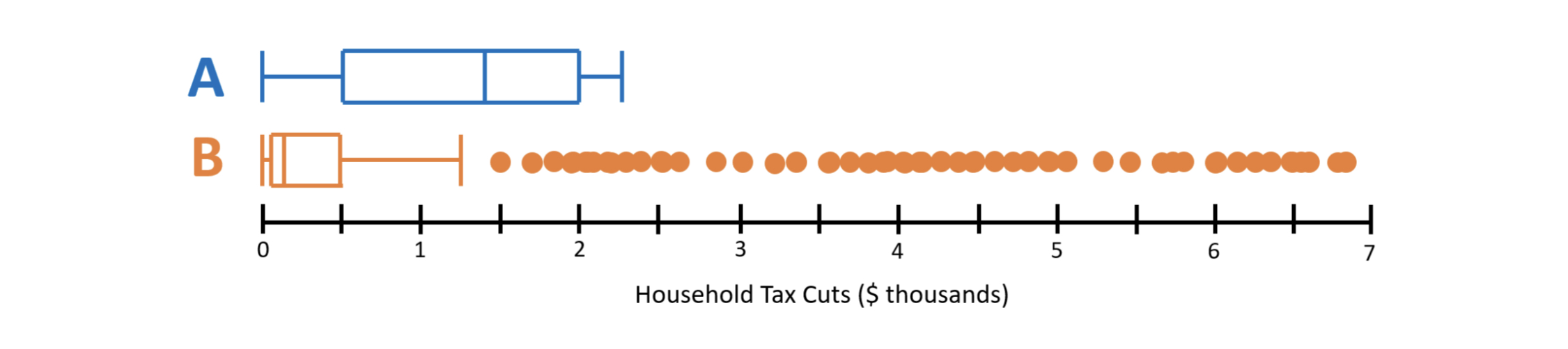
2) According to Boxplot A, what percent of households received tax cuts of $500 or higher? How about in Boxplot B?
It would be 75% who received $500 or more in Boxplot B it would be 25%.
The center of Boxplot A is significantly larger than Boxplot B.
3) Now, let’s compare these distributions.
Part A: Compare a measure of center within both distributions. (Hint: Which measure of center is displayed in a boxplot?)
RANGE: 2200 (max, Q3) - 0 (minimum, Q1) = 2200
IQR: 2000 - 500 =1300
Part B: Compare the IQR and range of each distribution.
RANGE: 6800-0=6800
IQR: 500-100=400
The range of the distribution is way larger than the IQR.
Part C: Compare the shapes of the distributions and explain how both distributions could have the same mean value.
Boxplot B is skewed all the way to the right and the mean is lower.
4) Which distribution (A or B) supports the idea that the tax pretty equally benefitted a broad swath of the American population? Which distribution supports the idea that the tax cuts mostly benefitted a smaller minority of households?
Distribution A pretty equally benefited a broad swath of the American population while Distribution B that mostly benefited a smaller minority of the population.
The Tax Policy Center released the following data about the actual tax cuts households experienced because of the 2017 Tax Reform bill.5 Note: Quintiles divide datasets into five parts, from the lowest 20% of values up to the highest 20% of values.
5) Based on the following table, do you believe the median tax cut is close to the median displayed in Boxplot A, close to the median in Boxplot B, or somewhere in between? Explain. Note: Your answer won’t be exact.
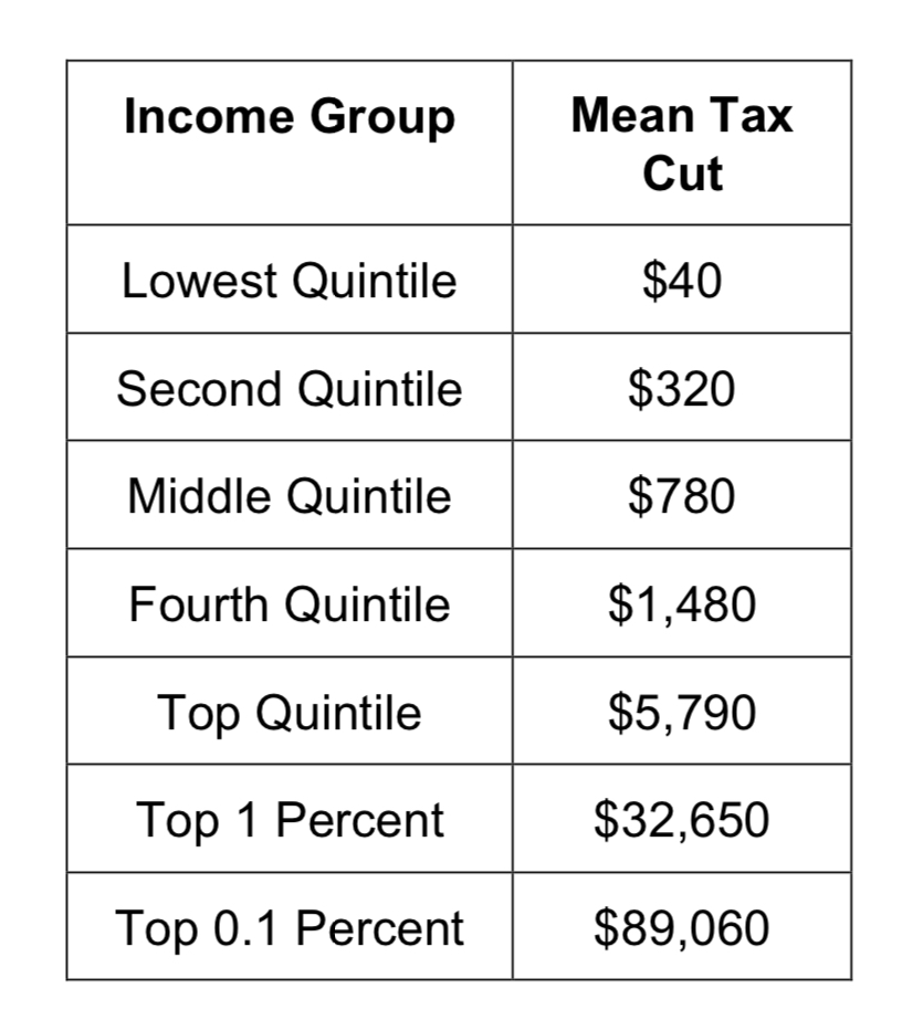
Yes, the median here is close to the one shown in Boxplot A.
6) Based on this table, where would you predict the maximum tax cut to be, relative to the maximum displayed in Boxplot B? Explain.
$5,790
7) Based on all your previous analyses, critique the following statement: “Only the wealthy benefitted from the 2017 Tax Reform. The middle class didn’t benefit at all.”
Some of the middle class benefited.
8) Based on all your previous analyses, critique the following statement: “The typical American household paid $1,260 less in taxes because of the 2017 Tax Reform.”
It takes into account 1 population, not all.