GCSE Graphs Rundown
Hi! This should hopefully help with GCSE graph knowledge (because I’m really bad at it). Hope you do well, and this explains it ok for you :))
IMPORTANT BITS TO START
Here are things you need to have good graphs:
A title (try and involve the bottom-line title (y axis title) and the upright axis title (y axis)
Axis (bottom line and upright line) labels WITH UNITS {such as cm, m or degrees)
Evenly spaced-out tick marks (places where you put the bottom and side numbers)
Axis must start at 0 (or have a squiggly axis break before them)
Line Graphs
Line graphs allow us to see how one variable (thing) changes as another variable (thing) changes to. [e.g. the more i get hungry, the more I want a chocolate biscuit]
But how do we know which variables go where on the graph sides???
First, we find which is the Dependant variable and which one is the Independant variable.
The Dependant variable is the variable we are Measuring, as the value depends on the value of the independent variable
Dependant = Thing we are measuring
This ALWAYS goes on the vertical (going up) axis (y)
The Independant variable is the variable we are measuring Against. It does not need any other variables to determine its value.
Independant = thing that chills on its own, isn’t ever tempted by other variables.
This ALWAYS goes on the horizontal (sideways) axis (x)
But how do we draw them???
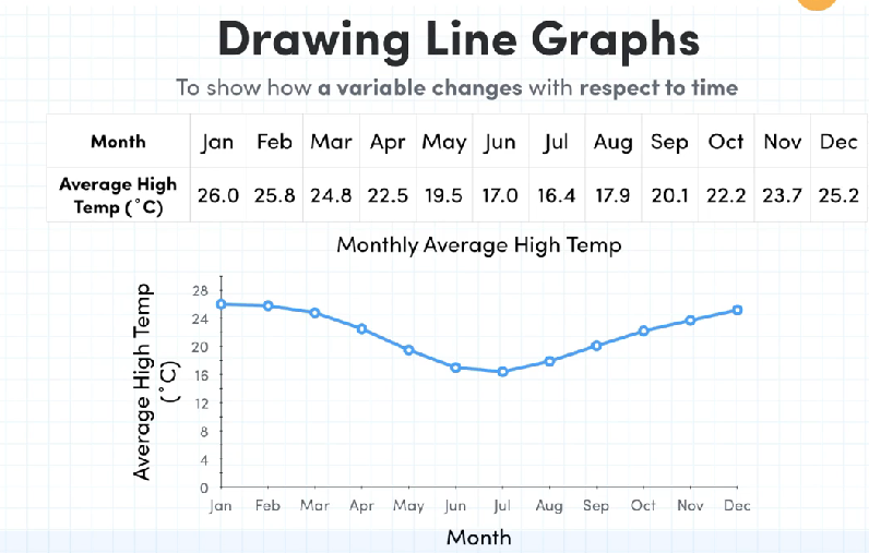
The table matches exactly with the line graph, showing the monthly average high temperature. This is measuring how the temperature CHANGES over the course of the year (or how does the temperature depend on the month of the year)
This means that the temperature is the dependant variable (as it depends on the month) and the Months are the Independant variable (as they keep going like there’s no tomorrow).
We have LINES (hence being called a line graph) connecting the individual points.
Little points:
Remember bits at the start of notes.
Interpreting Trends and Time series
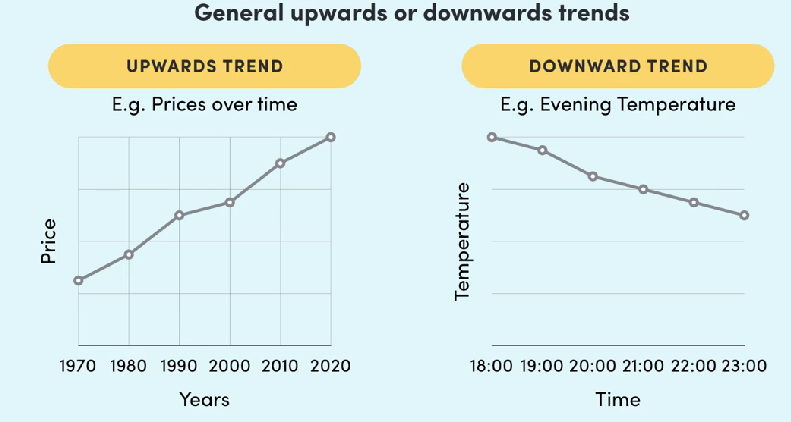
These are pretty easy. If it’s generally going up, it’s an upward trend. If it’s generally going down, it’s a downward trend.
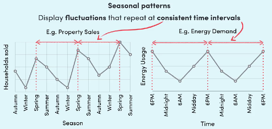
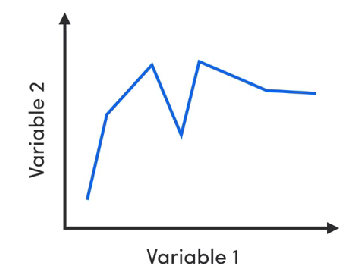
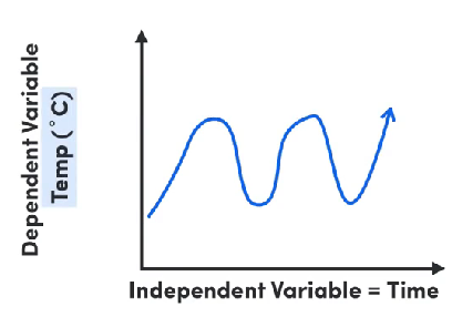
These are seasonal patterns. These show fluctuations (rising and falling of bits on your graph) which always have roughly the same time in-between happening.
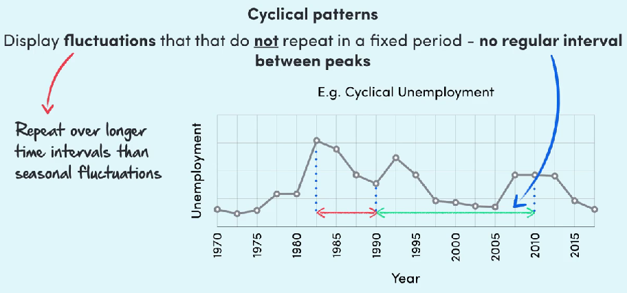
This is a cynical pattern. These are wonky and irregular fluctuations (weird rising and falling remember) that happen randomly and have different time spaces within them.
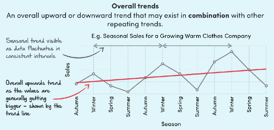
Finally overall trends. This takes a general guess of what things are happening, combining it with other trends ^^^ and making it sound fancy:
“The overall trend displays an upwards path, displayed by the trend line, in combination with seasonal trends visable throughout the graph”
Honestly it is just waffling.
Y=mx+c
This is something i have already struggled with so let’s figure it out together!
You need to remember this though
Y=mx+c
As soon as you see a graph, write down Y=mx+c
Y=mx+c
It looks scary, promise its not. Its just the Y intercept = gradie…. errr
heh. Well this is good, we can remeber together!
First, we need to know the
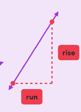
Gradient of a graph
This is the steepness of a line on a graph. The Gradient is basically the rise divided (/) by the run, or the change in y over the change in x. The higher the gradient, the steeper the slope!