


DCMP 5D Assignment
5D
PART 1: Identify two quantitative variables in the data. What possible values do these variables take in the dataset?
*Age (*20 [min] - 80 [max])
SleepHrsNight (2 [min] -12 [max])
PART 2: Identify two categorical variables in the data. List the possible categories these variables can take.
Attend College (Yes or No)
PhysActive (Yes or No)
2) In this project, you will create univariate, bivariate, and multivariate graphical displays for quantitative and categorical variables. Identify one or two DCMP Data Analysis Tools at https://utdanacenter.org/data-analysis-tools (or other tools) you can use to create these graphs. Include the name of the tool and the type of graph you can create in your answer.
DCMP tool for displaying quantitative data. Histogram would be the best kind of graph to display the data.
DMCP tool for displaying categorical data. A bar graph would be best suited to display this data.
3) Part A: Describe what is meant by “writing in a way that could be clearly understood by a general audience.”
A way that something could be written in order to be clear to the audience is, data that is organized clearly and displayed in a way that can represent all the variables.
Part B: Refer to the project rubric. Based on the rubric, what are qualities of a report that are suitable for an academic or professional setting?
Data is organized well and is accurate from the study. Interpretation is correct and has a complete description of what the graph looks like.
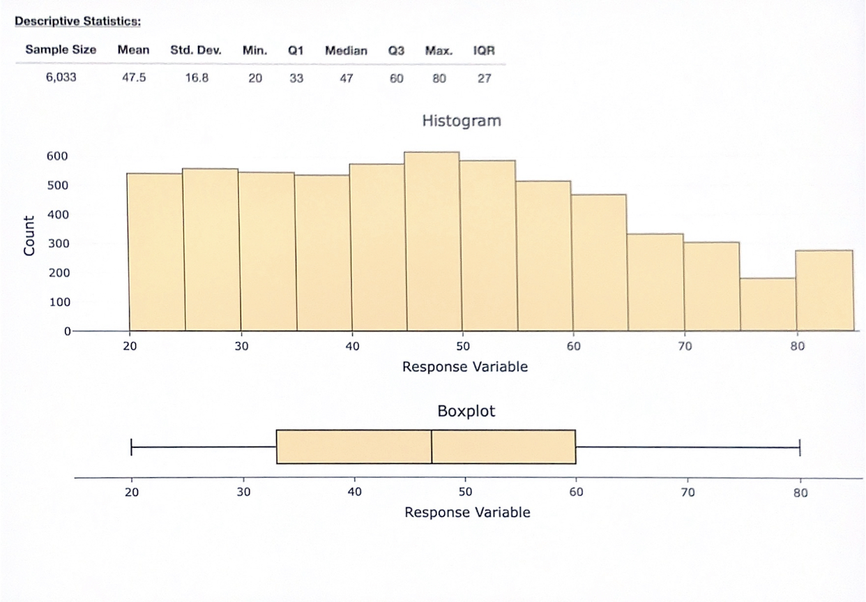
4) Let’s begin by looking at the ages of the survey respondents. Part A: Use technology to create a histogram of Age**.**
Part B: Describe the distribution. Include the shape, center, spread, and the presence of outliers in your description, using appropriate summary statistics as needed.
Shape: Right-skewed
Center: Median: 47, Mean: 47.5
Spread: 60
Outliers: None
Part C: The distribution shows a small peak around 80 years old. (Note: Changing the binwidth of the histogram makes the peak more or less noticeable.) Briefly explain why there may be a peak around this value.
There are a number of people who were closer to age 80, given there were more people recorded in this age range, the graph goes up to show that that section is more populated.
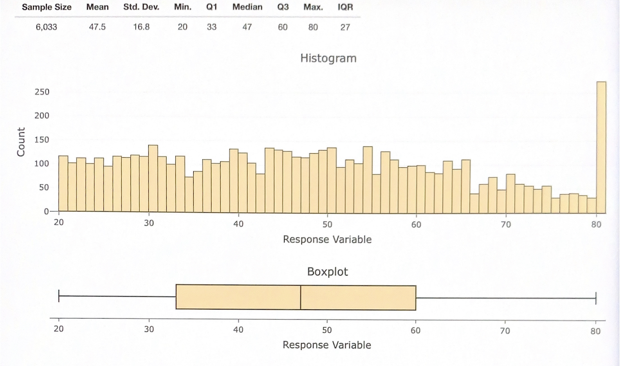
5) Next let’s examine how the respondents generally perceived their health. Create an appropriate graphical display of HealthGen**. Then use the graph to describe two different observations about the respondents’ general perceptions of their health.**
In the two graphs above, it shows the same spread at different set group intervals. The data shows that the most active people were mid aged, skewed to the left to younger people. This graph shows me that the general perception of the measured population's health was geared towards younger individuals.
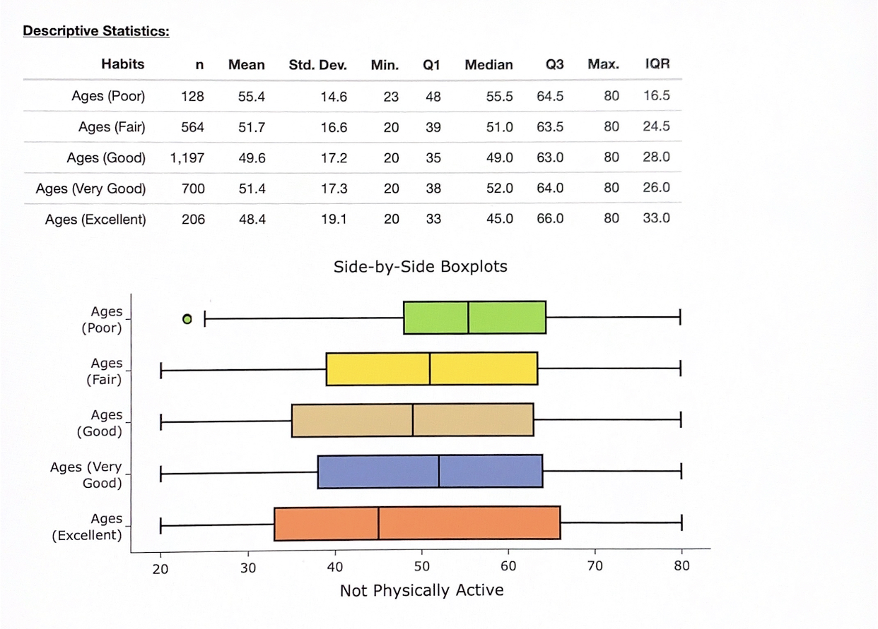
6) Now let’s examine whether there is an association between health perception and whether a person performs regular physical activity. Create a graphical display to visualize the distribution of HealthGen for each category of PhysActive**.**
Does there appear to be a difference in general health perception between people who perform regular physical activity and those who do not? Write two observations from the graphical display to support your response.
The two graphs seem to be similar but once you look at it more closely you can see that there are less people in the poor and fair section in the graph where people are physically active. Whereas there are less people in the good and excellent category in the bar graph where the people aren't physically active.
7) A popular health and wellness website is writing an article that explores the following questions:
(1) Does having a habit of regular physical activity change with age?
(2) Does the association between age and health perception differ based on performing regular physical activity?
They would like to include a graphical display in the article to help readers visualize conclusions in the article about the associations between the variables. The authors propose the following graph, but the website editor is concerned it may be confusing to readers. She has asked for your help to improve the graph and write an interpretation of the graph that will be included in the article.
Part A: Describe two ways this graphical display may be confusing and/or makes it difficult to explore the questions of interest for the article.
One way this graphical display may be confusing is the order in which the HealthGen categories are displayed (Excellent, Fair, Good, Poor, Very Good). They should be arranged from Poor, Fair, Good, Very Good, and then Excellent. This would make it easier to read as it goes from the participant’s self rating of their health.
Another way this graphical display may be confusing is because the bars are so close together and how bright the colors are. Those two factors make it harder to read. The graph can be more spaced out and use dimmer colors to make it less confusing and easier to read.
Part B: Use technology to make an improved graphical display that can be effectively used to answer the two questions of interest. You may use multiple graphs, if needed.
In statistics, we often need to manipulate the structure of the dataset in order to create the visualizations. Locate the reorganized dataset (DCMP_STAT_5D_nhanesYesNo) that includes only the variables for this question that aide in the creation of your visual display.
Boxplot (Physically Active) Histogram (Physically Active) 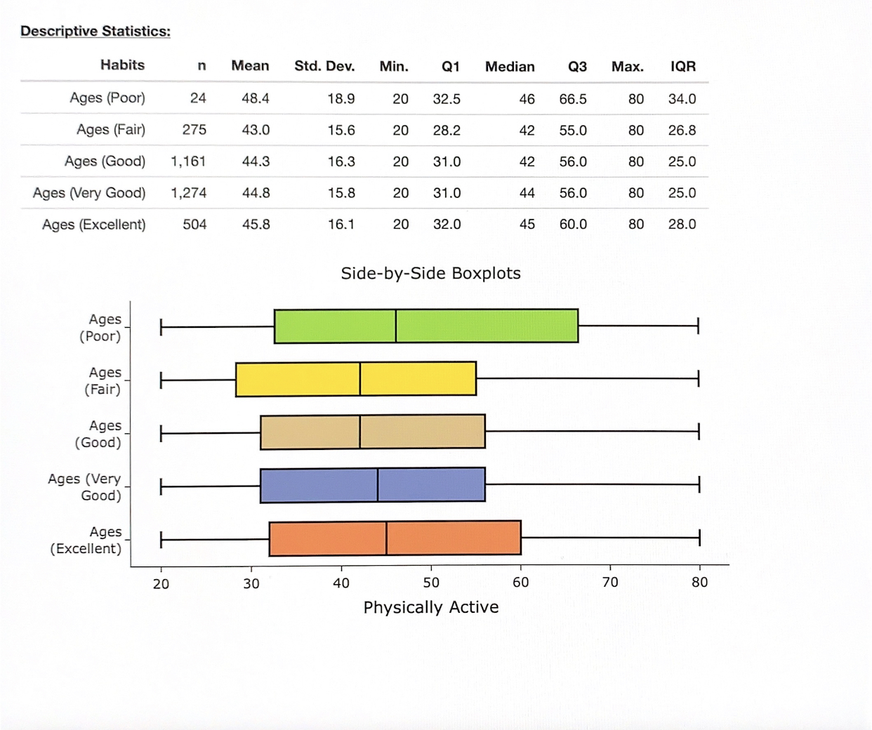
Boxplot (Not Physically Active)
Histogram (Not Physically Active)
Part C: Use the graph(s) to answer the two questions of interest for the article. Write a short paragraph (three to six sentences) that includes your answers to the questions and observations from the graph(s) that support your response. The response should be written in a way that is clearly understood by a general audience.
No, having a habit of regular physical activity doesn’t change with age because the mean age of people who are physically active is around the same which is in the 40’s. Yes, the association between age and health perception does differ based on performing regular physical activity. The people who perform regular physical activity have a similar mean age of who is active, regardless of the habits they have (poor, fair, good, very good, excellent). For the people who don’t perform regular physical activity, people who have excellent habits are more likely to be younger than the other habits.